Project Overview
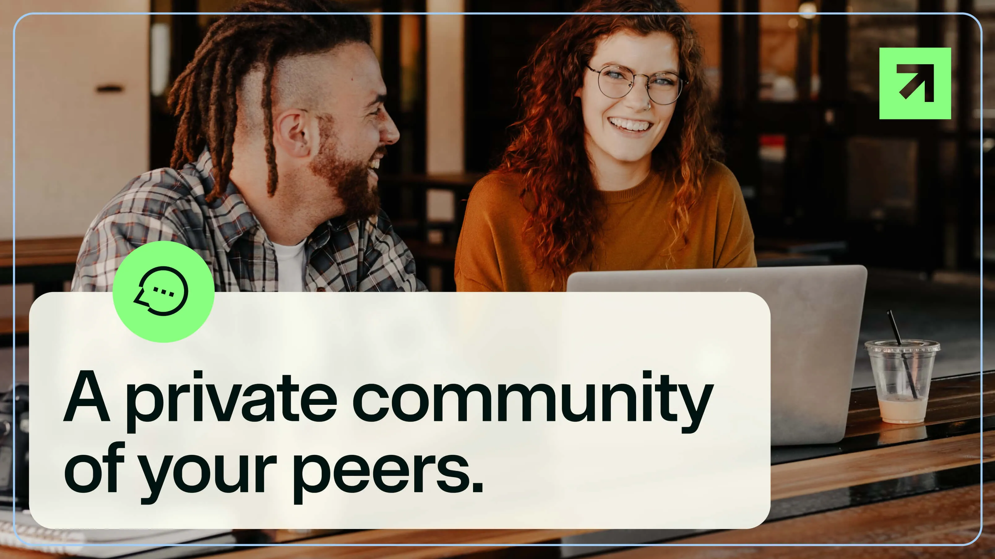
Exit Five is a community for B2B marketing professionals. While the brand was already well-known, it needed a fresh look to help it stand out from competitors. I created a new visual identity that helps them tell their story in a more unique and memorable way.
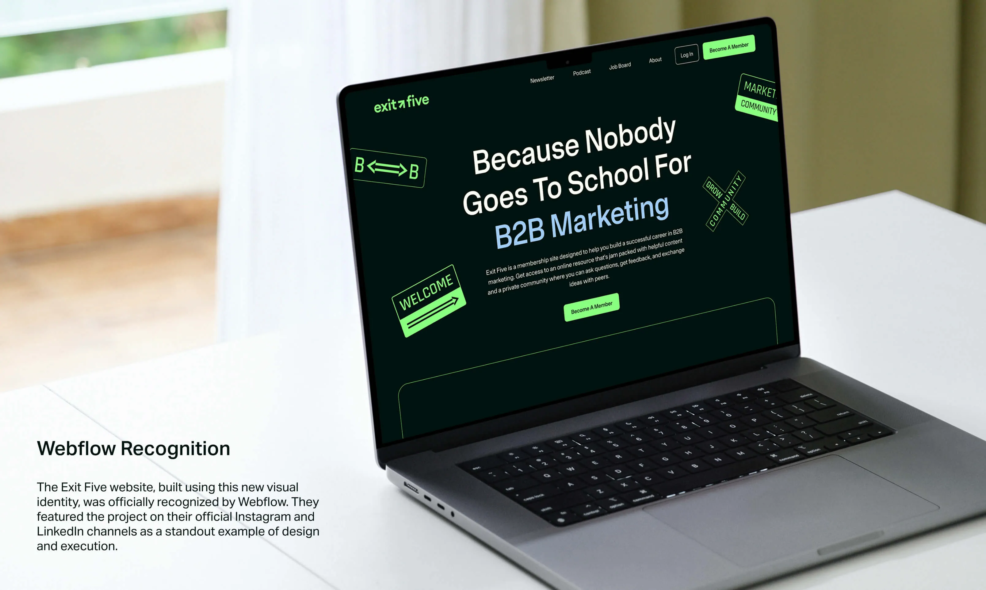
Webflow Recognition
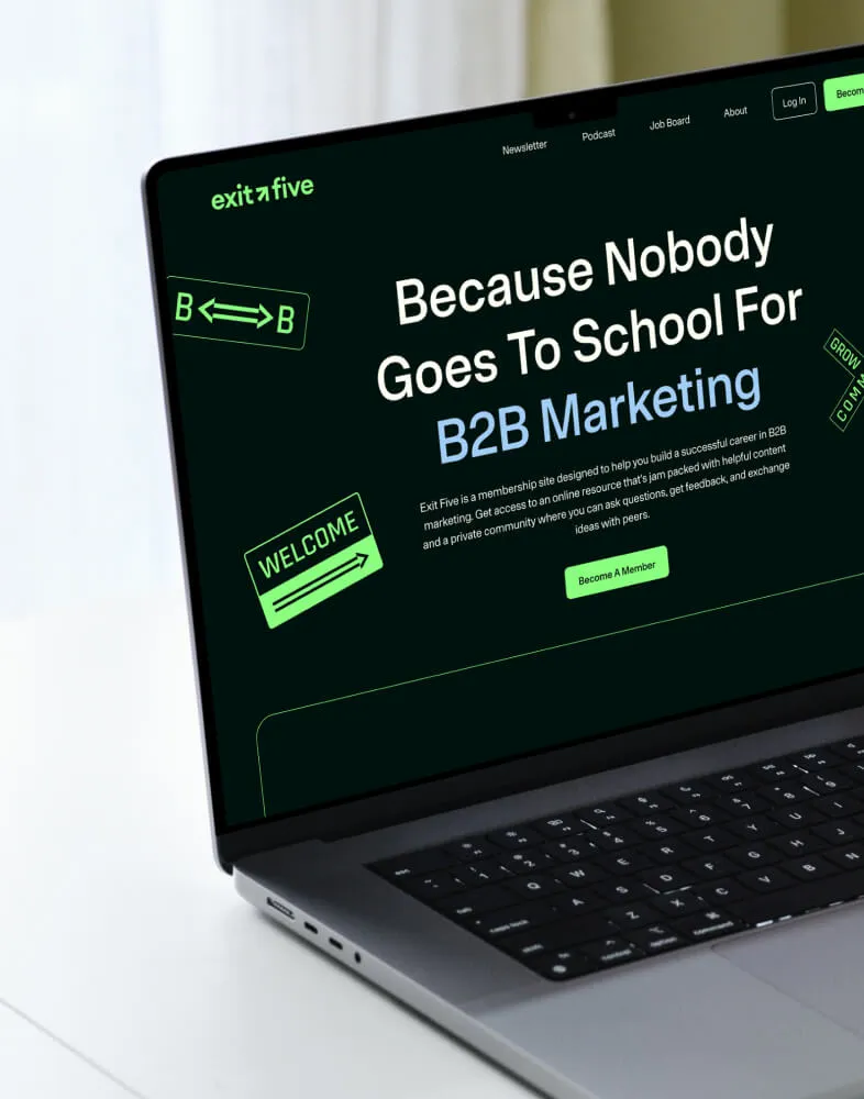
The Exit Five website, built using this new visual identity, was officially recognized by Webflow. They featured the project on their official Instagram and LinkedIn channels as a standout example of design and execution.
The Logotype
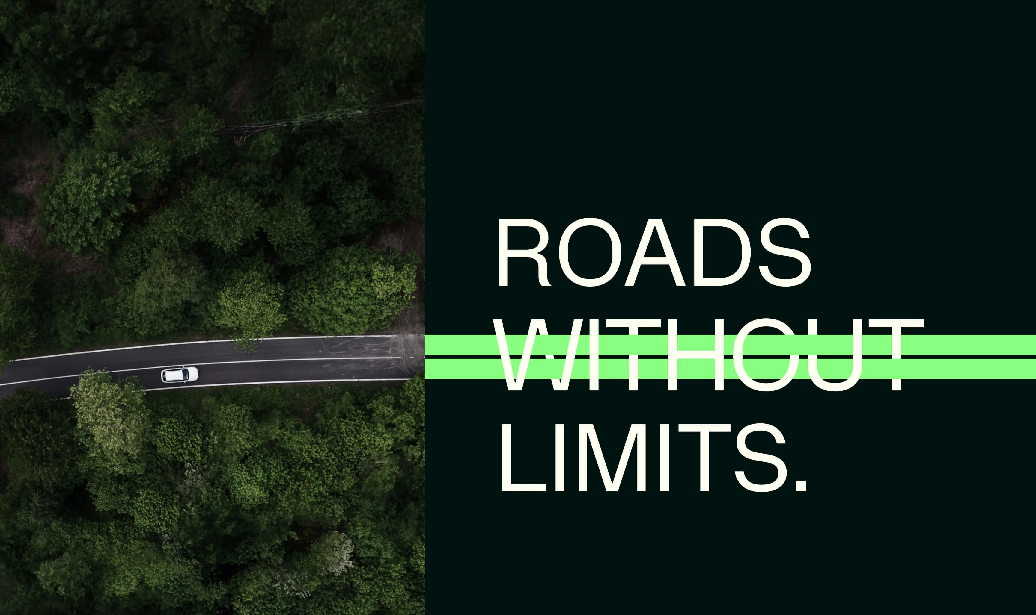
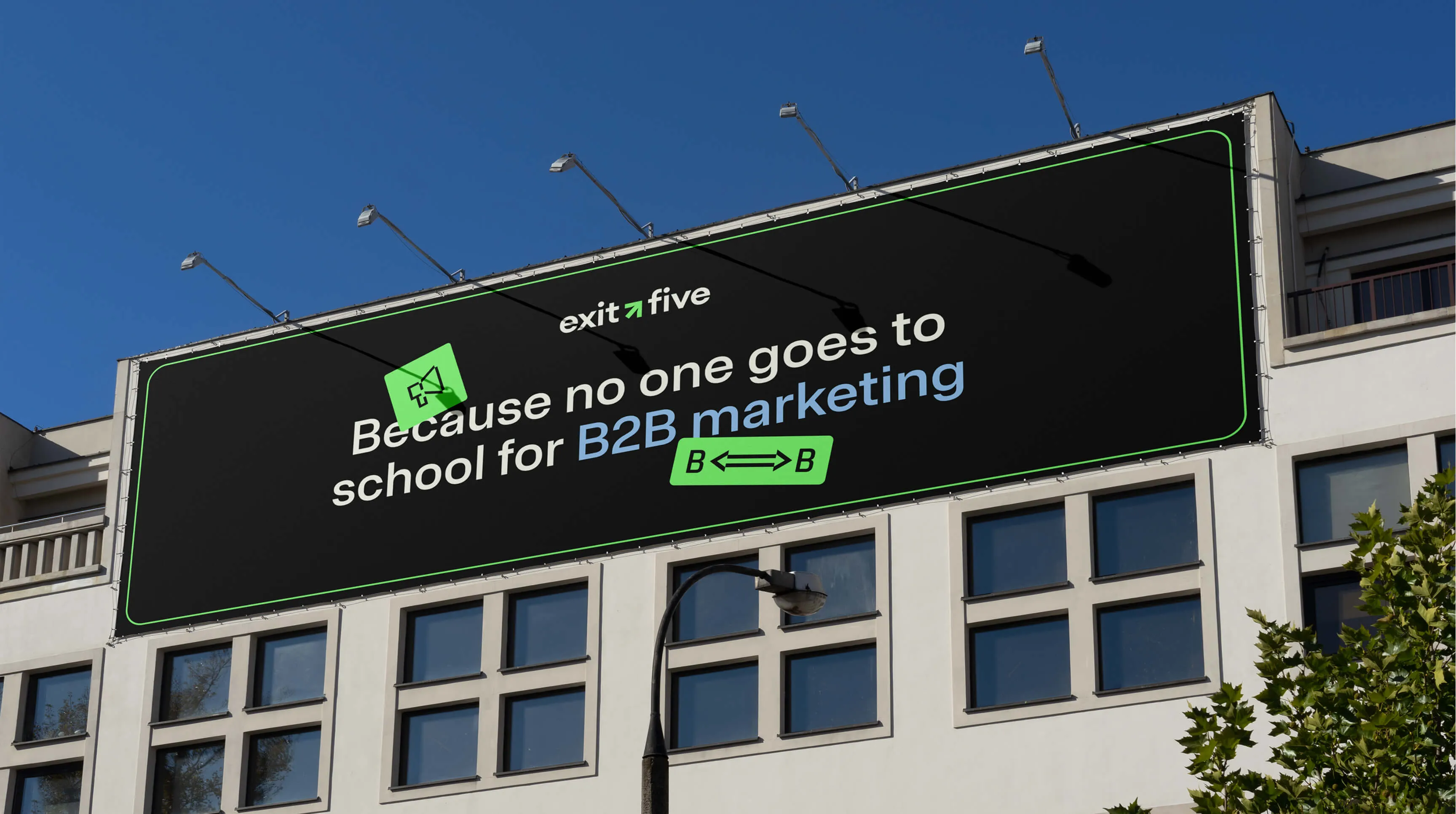
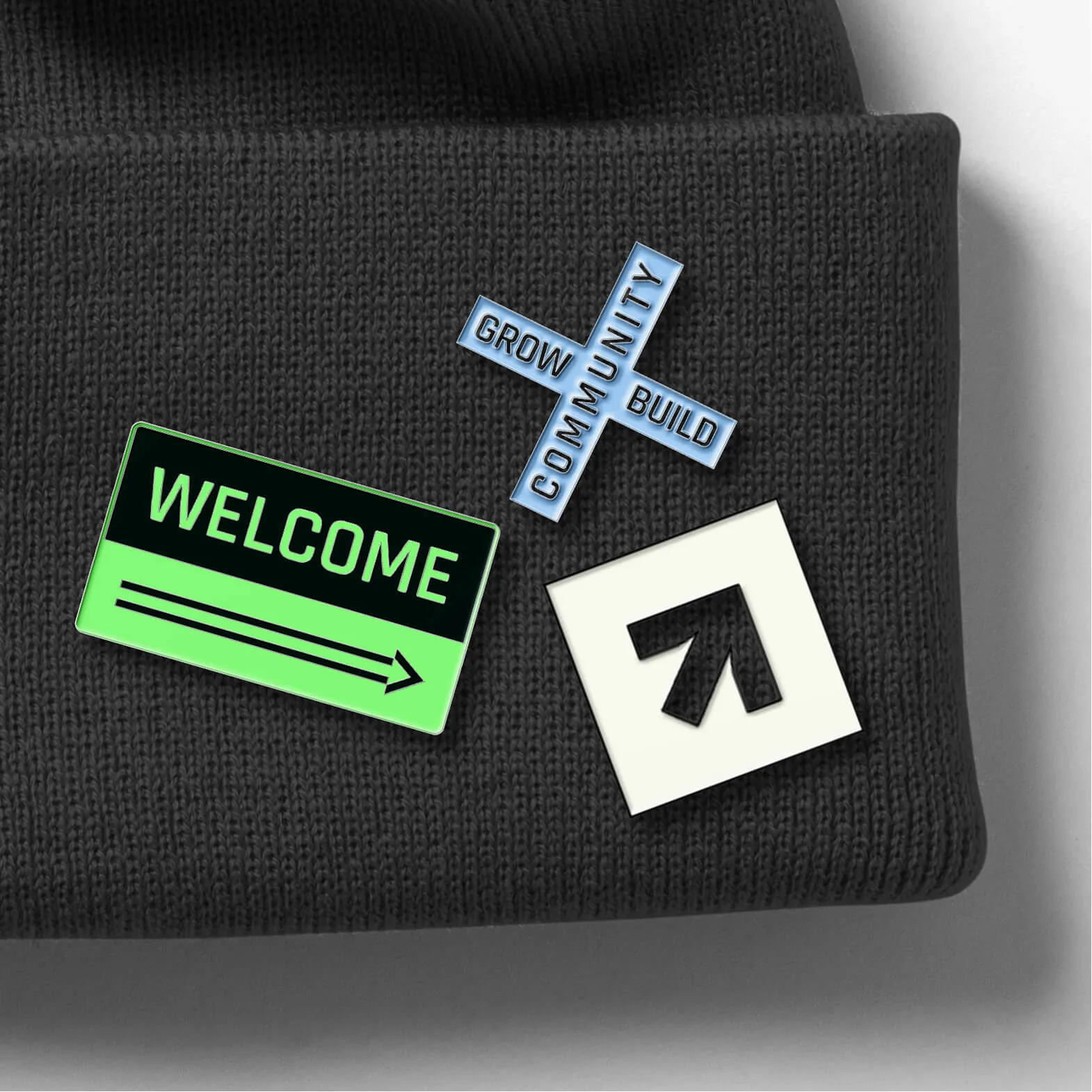
The logo is inspired by the brand’s name and its history. It’s based on the familiar look of a highway exit sign—specifically the one the founder used to take. We combined that nostalgic feeling with a modern design to create something both classic and new.

Visual Language
We blended road elements with marketing themes to show the "journey" of a B2B marketer. We turned U.S. road signs into icons and used road imagery as a main theme. It’s an invitation for marketers to take the "Exit Five turn" to find new opportunities in their careers.


Impact
This was a close collaboration with founder Dave Gerhardt. To show the power of our work, we skipped the moodboards and presented an almost finished design right away. Dave loved it, and the project became a huge success. The website was featured on Webflow’s social media, and the design caught the eye of many SaaS companies, bringing a wave of new clients to our agency.
noboringdesign.com
Built with the Noboringdesign crew.
Project: Visual Identity for Exitfive
My Role: Lead Designer
The Team:
- Creative Direction: Alina Shupikova
- Web & Quality Control: Juan Pablo Lopez
- Motion Design: Leonel Carreras
visual identity
Exitfive
A community for B2B marketers
visual identity
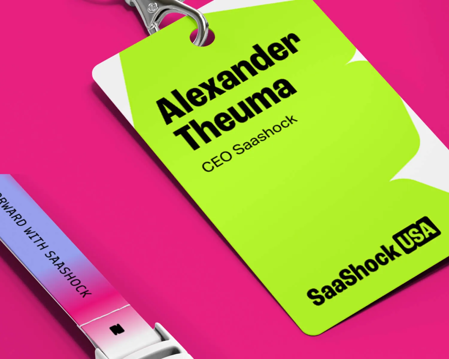
Saashock
A conference for SaaS founders and leaders
visual identity
Rejected project
A European cybersecurity conference concept

visual identity
Mixmax
An AI-powered sales platform
visual identity
****
An AI-powered beauty & wellness marketing startup
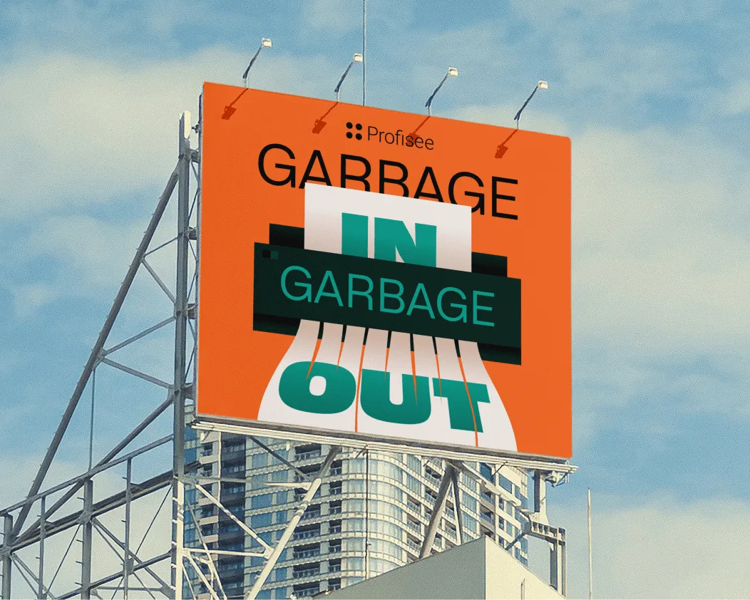
Digital ads
Various Clients
A collection of my favourite ad designs

Animated videos
Allo Fiber
A TV advertisement for a US fiber internet provider
Illustration
Passion project
A personal illustration series on war and belonging