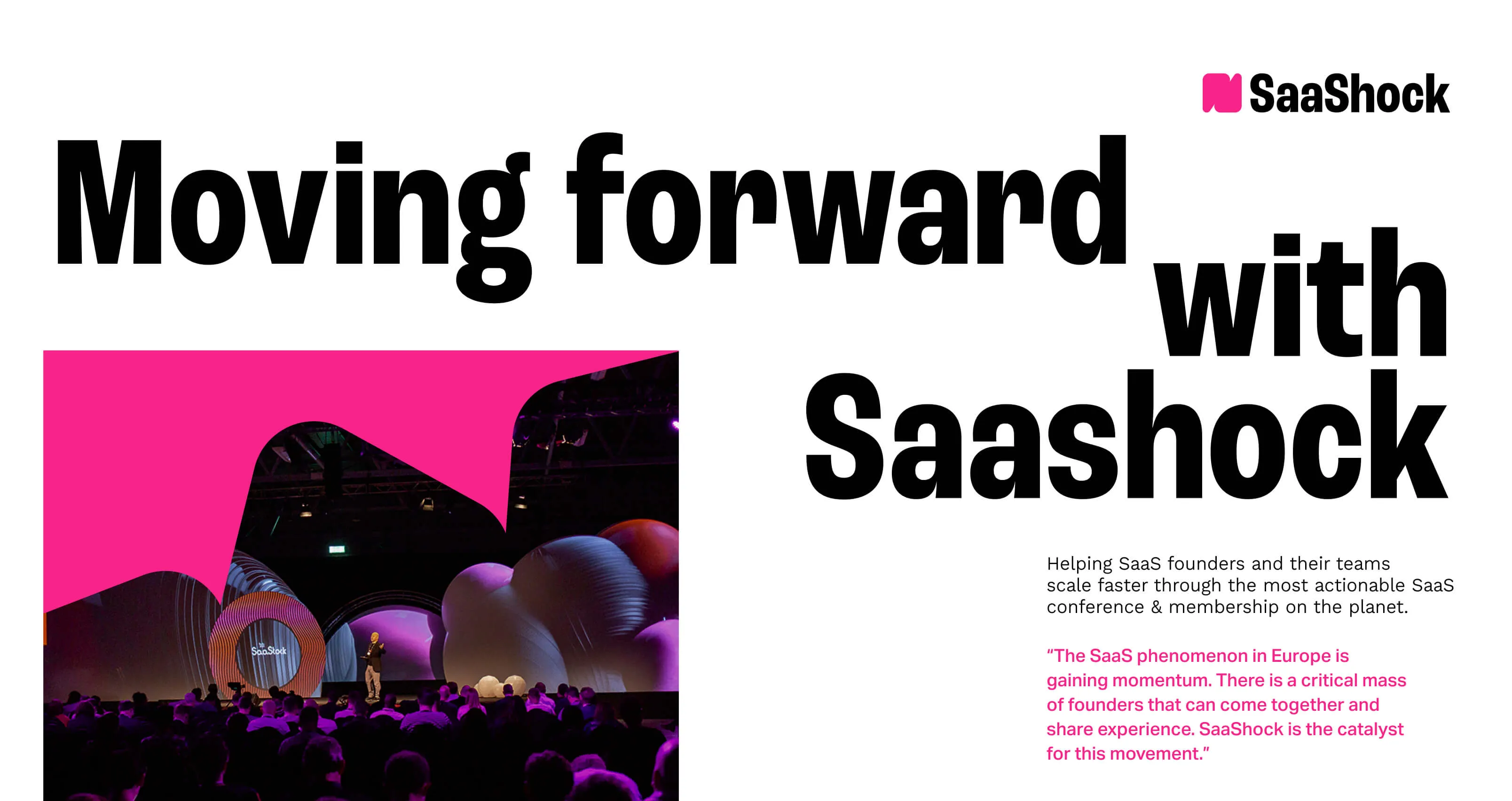
Project Overview
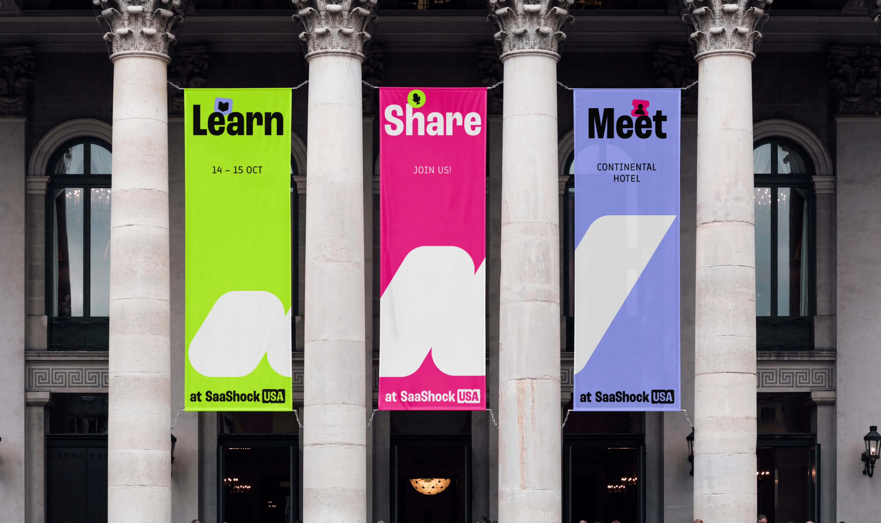
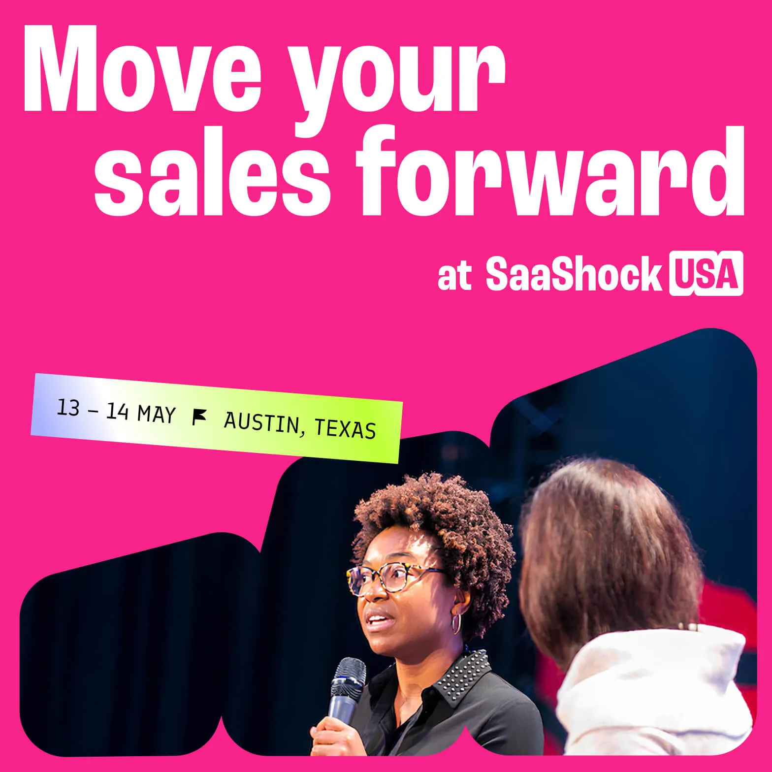
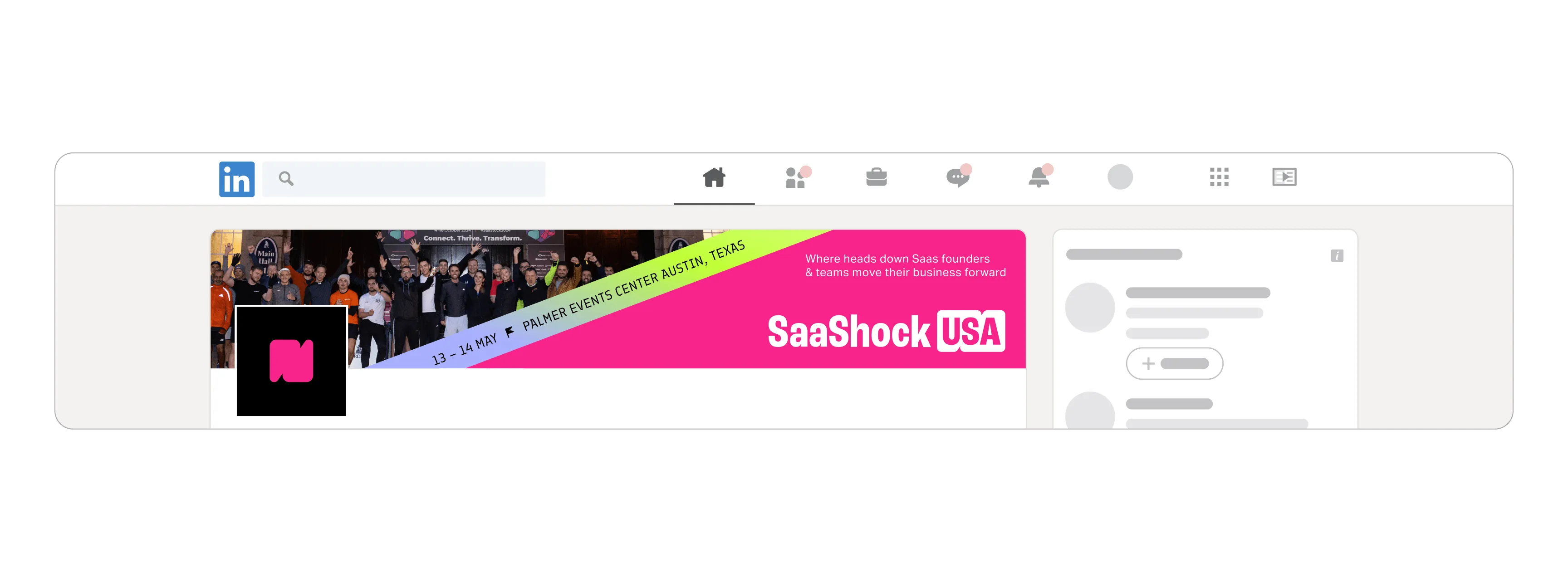
SaaShock is a global community and events platform for the B2B SaaS industry. They needed a new brand identity to communicate their three main pillars: events, community, and education.
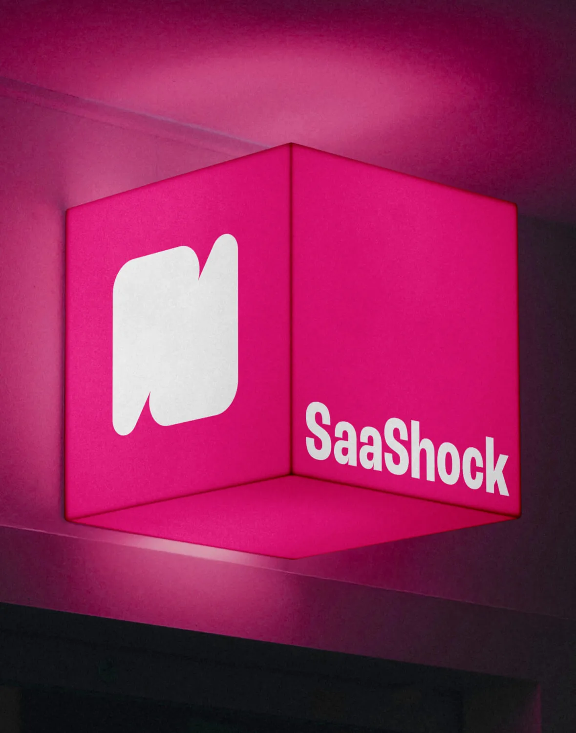
The Logotype
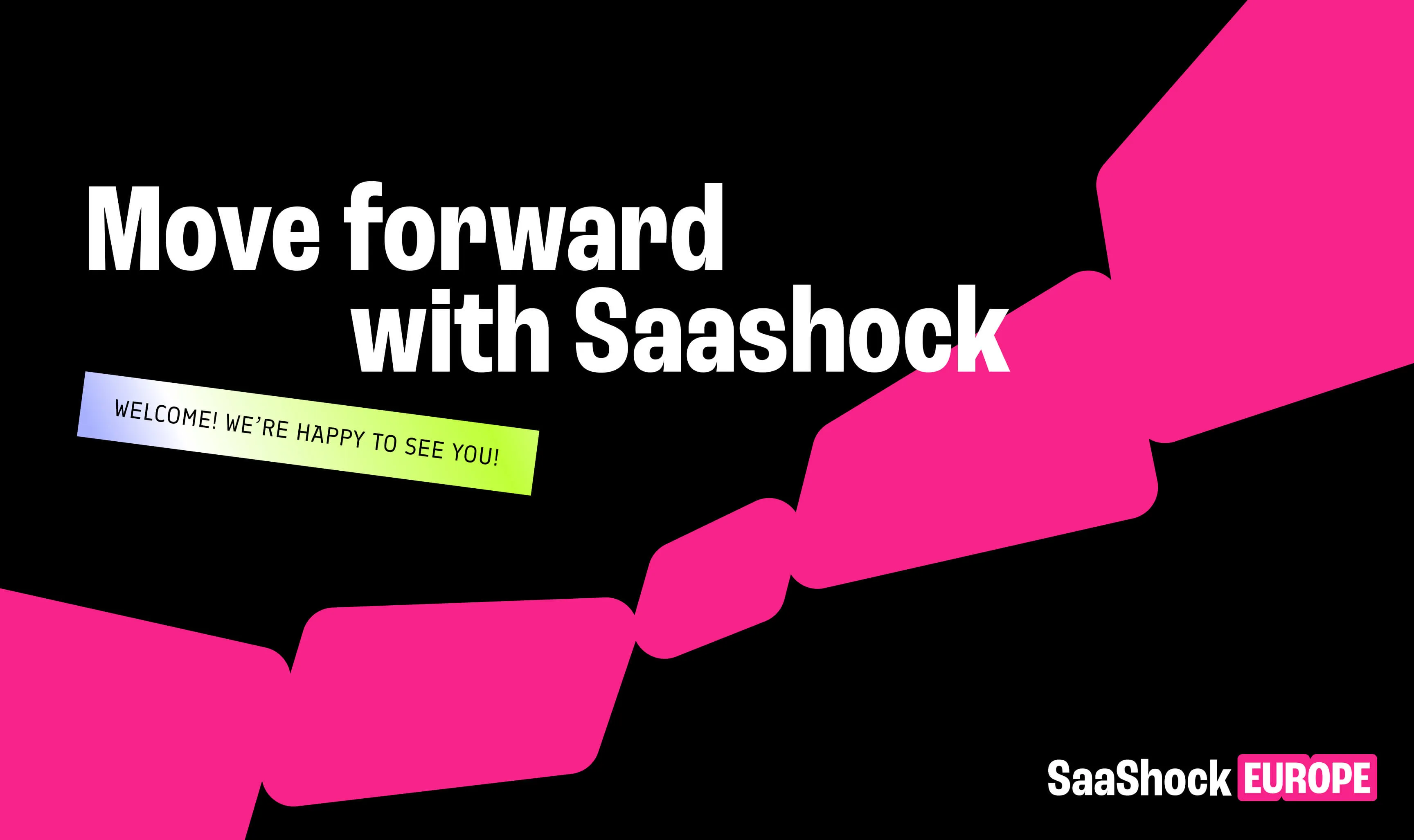
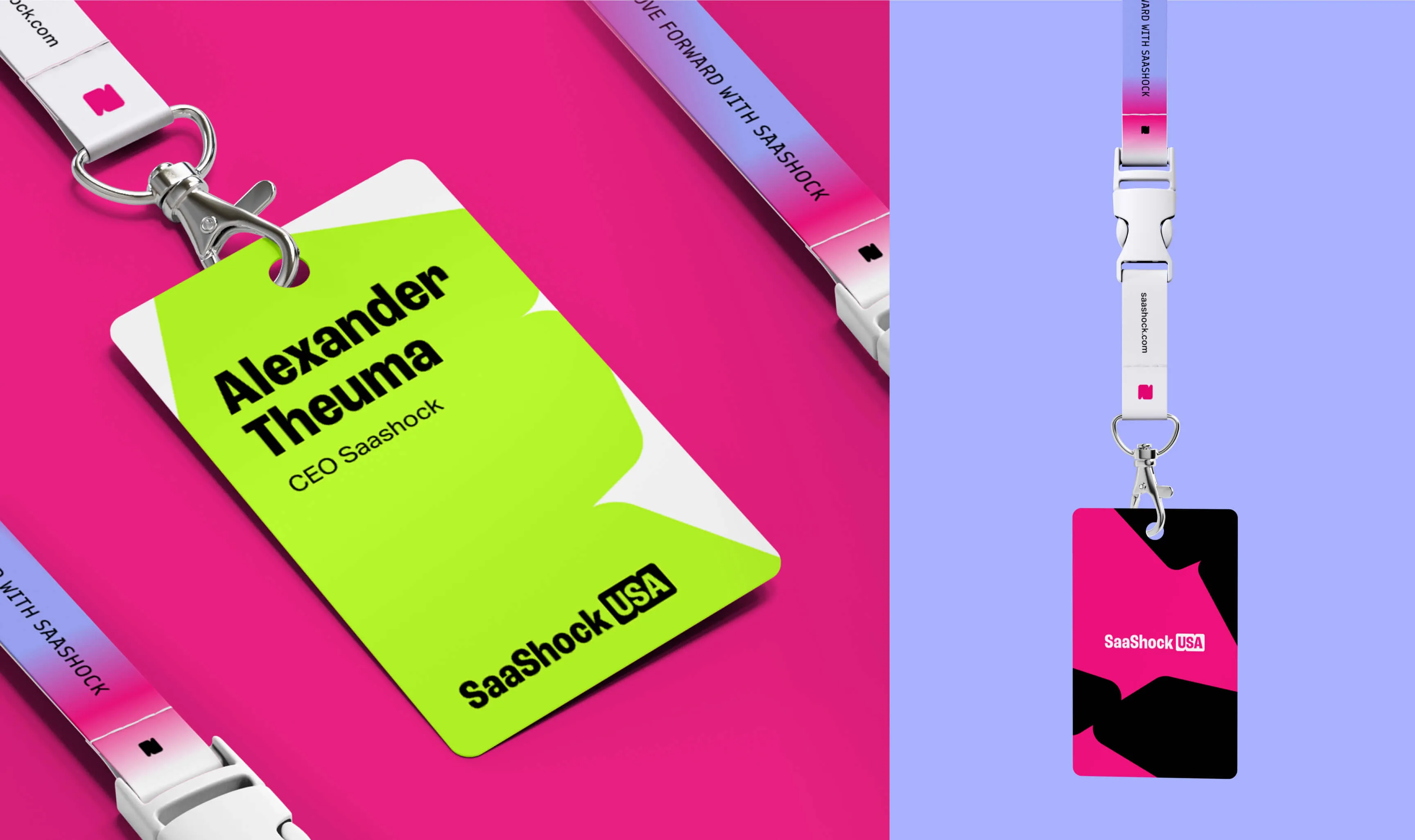
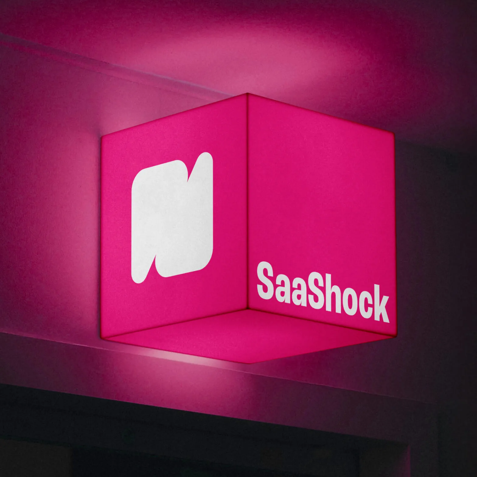
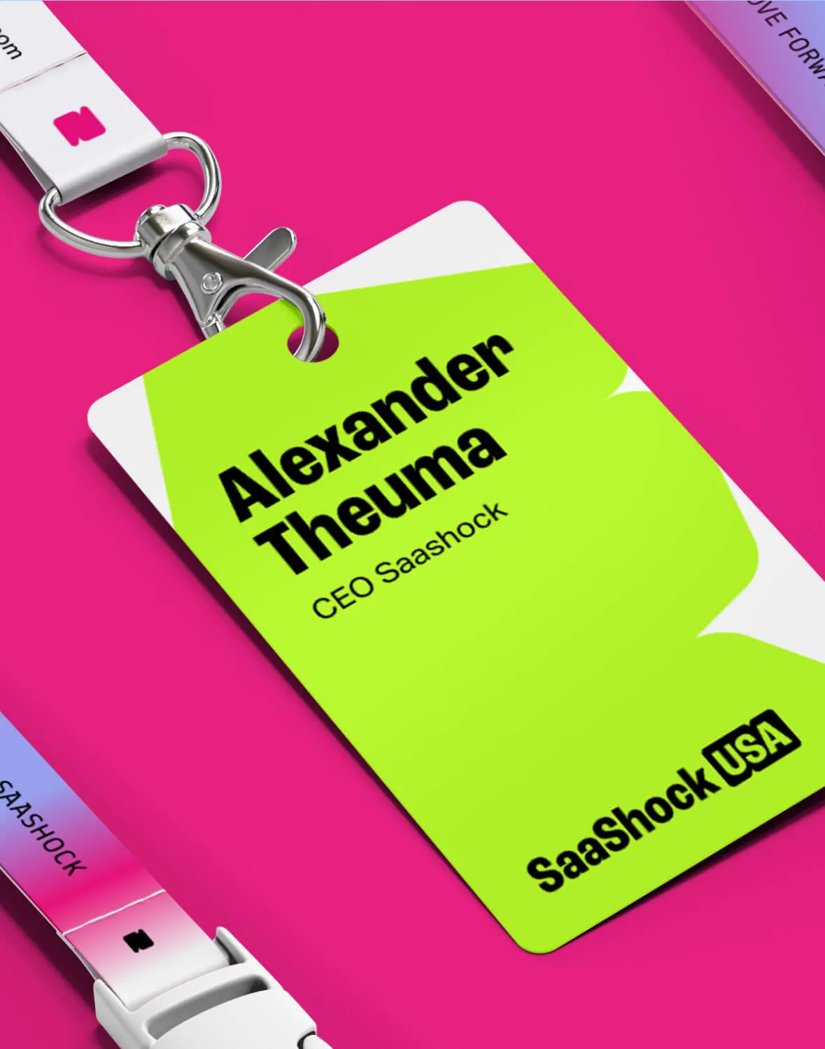
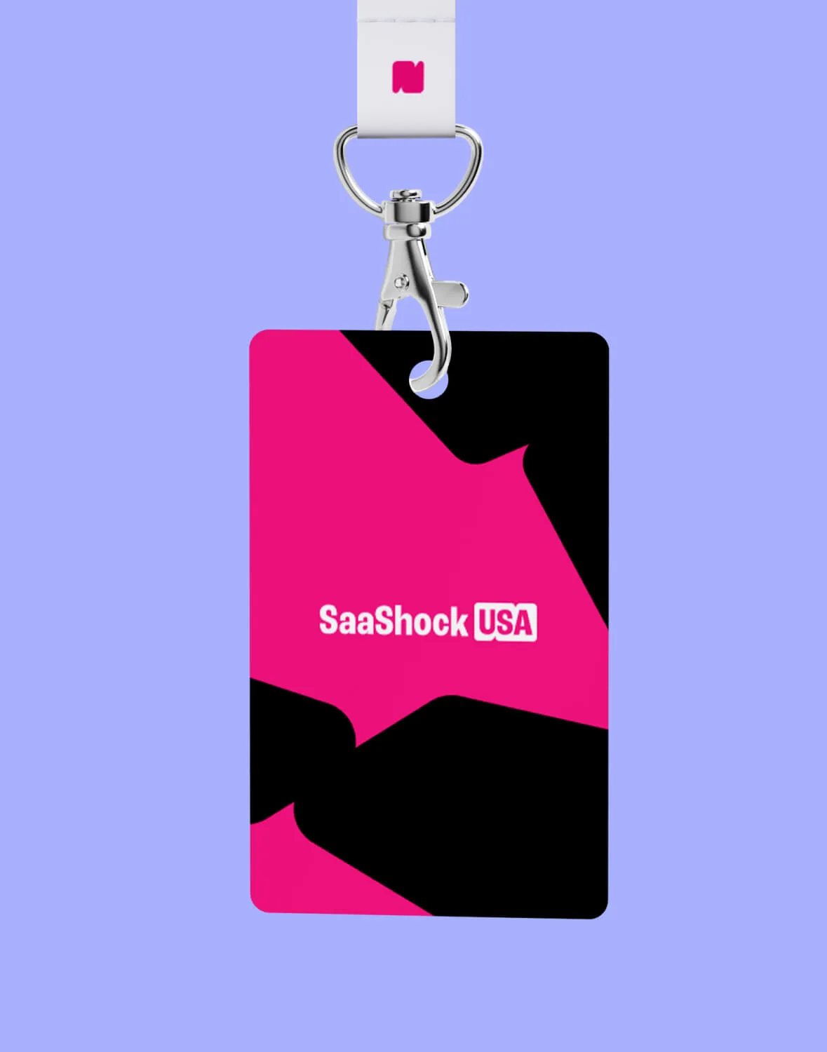
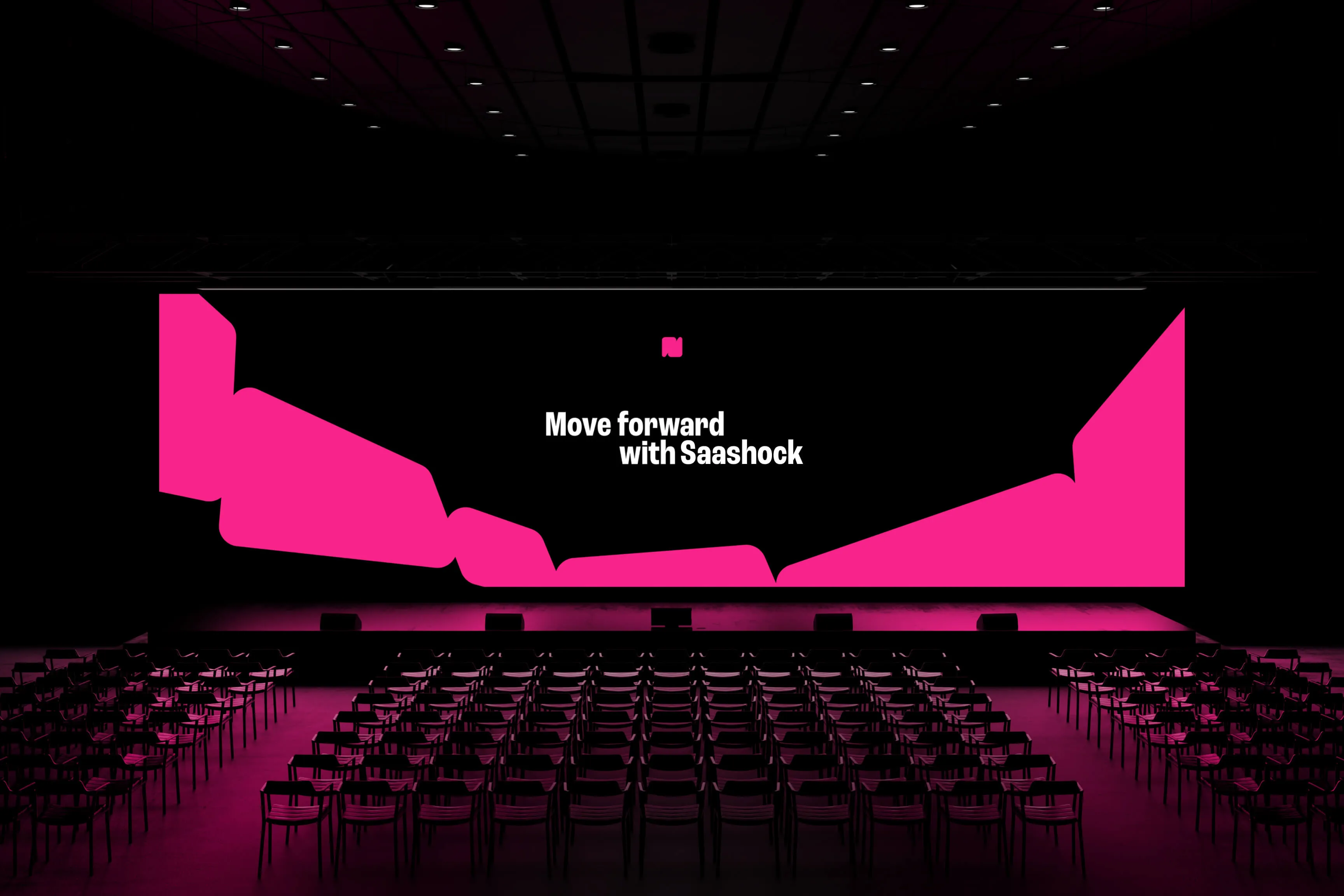
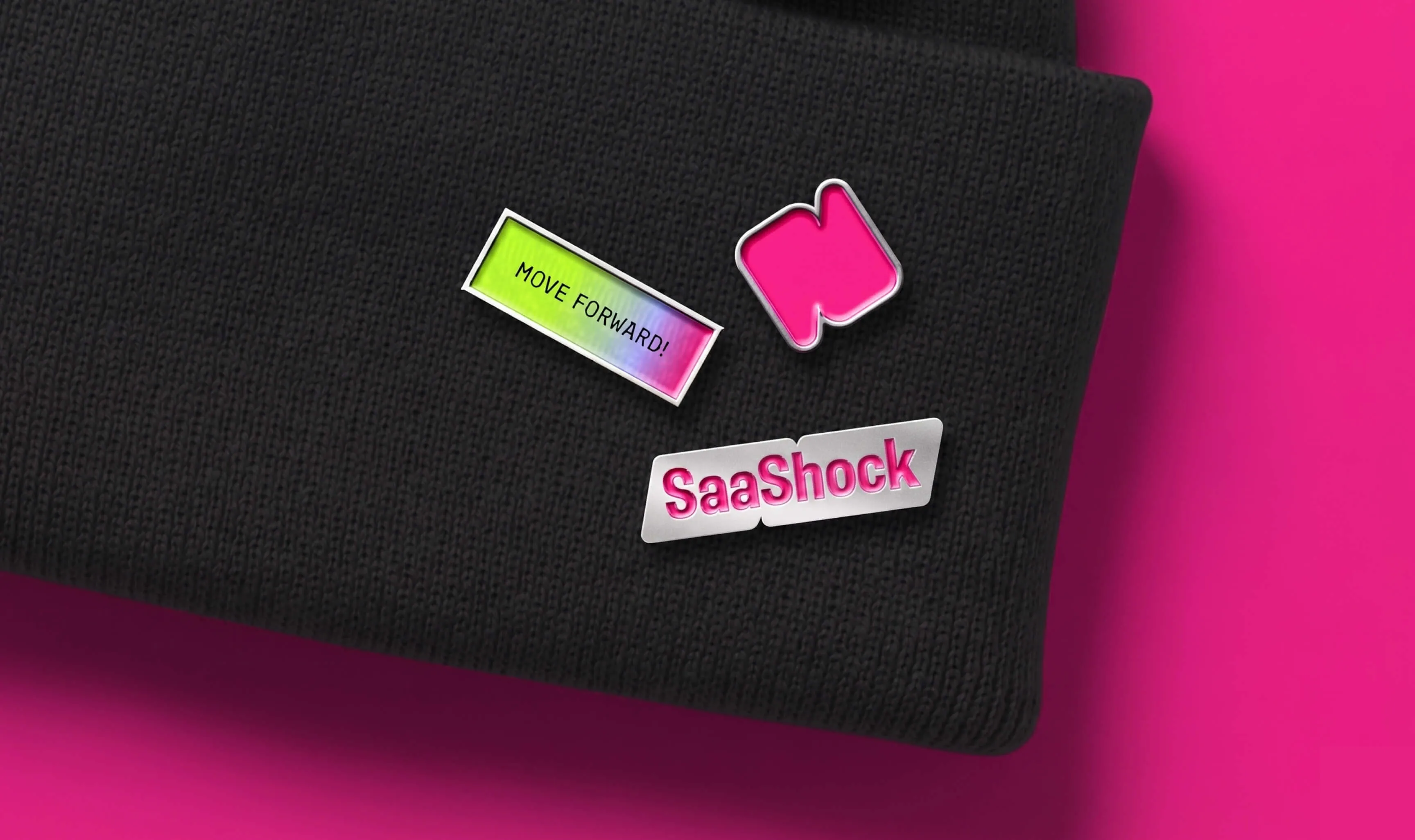
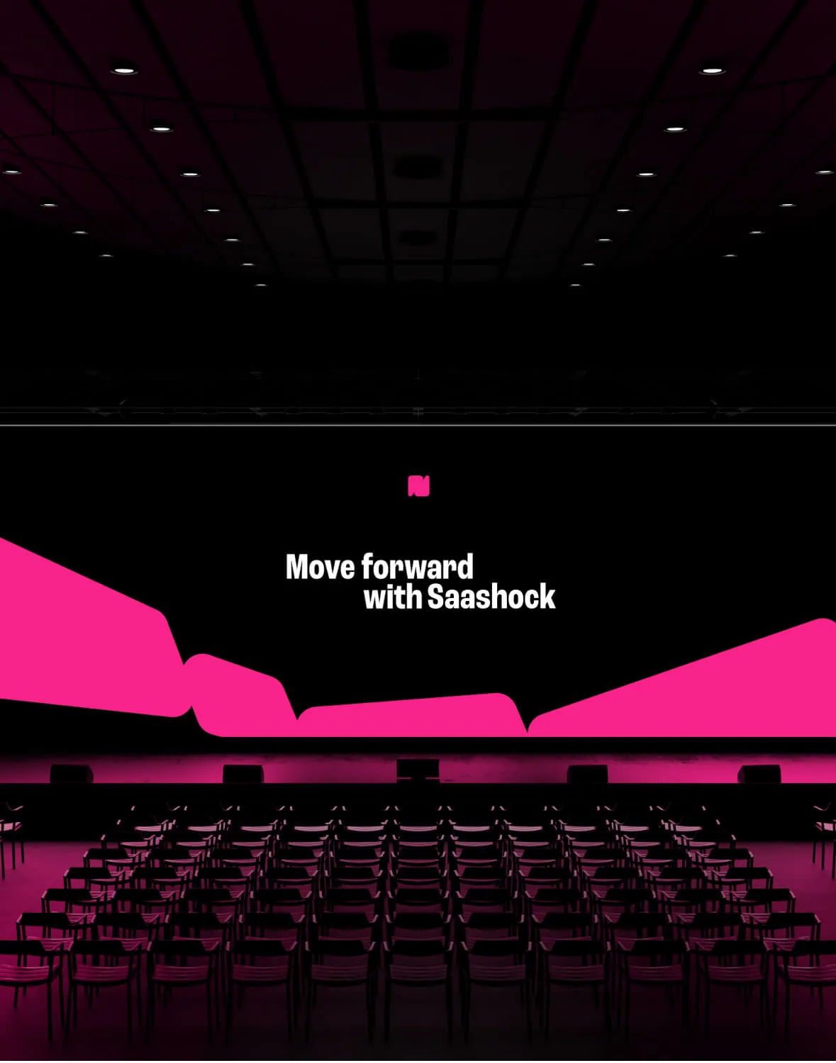
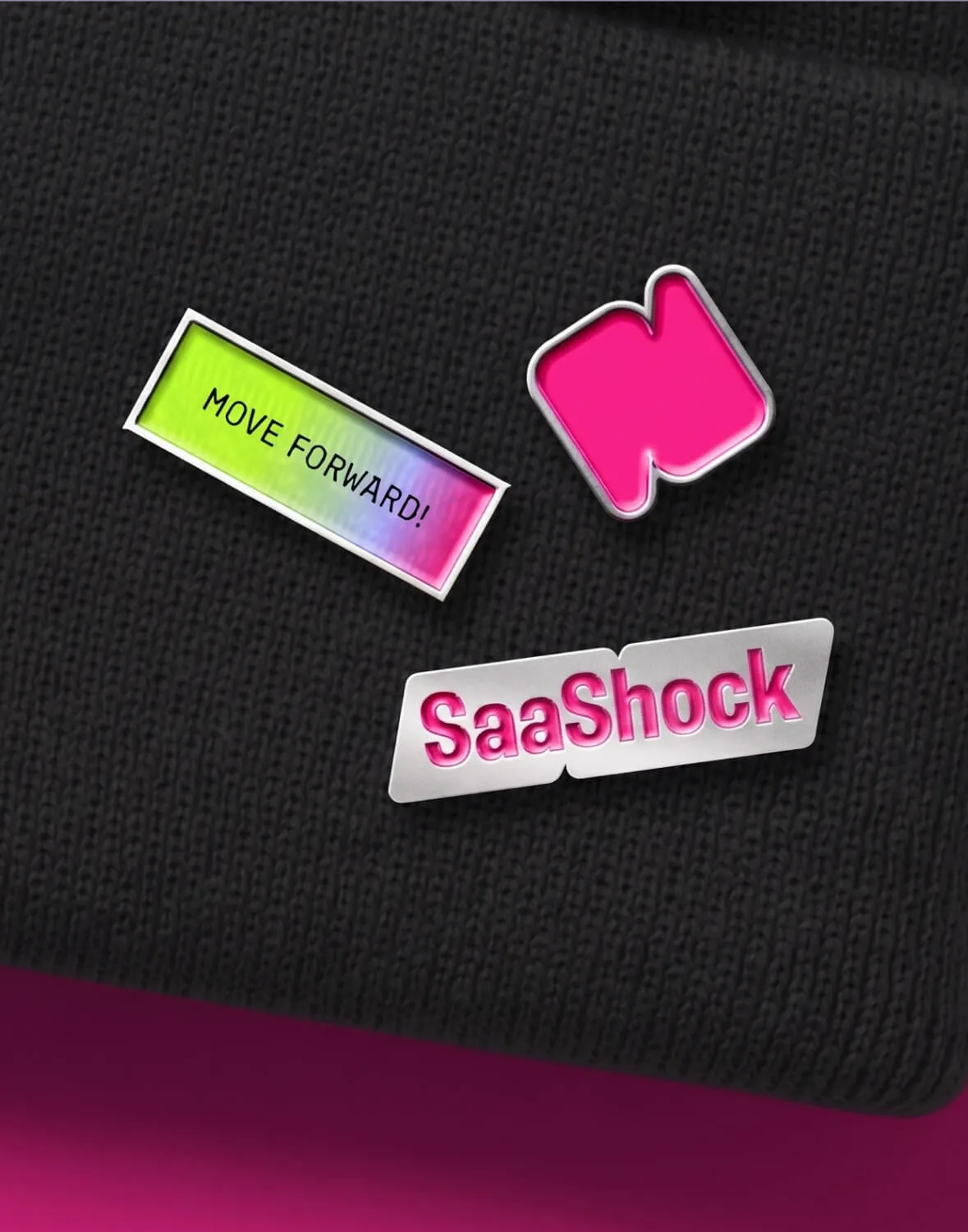
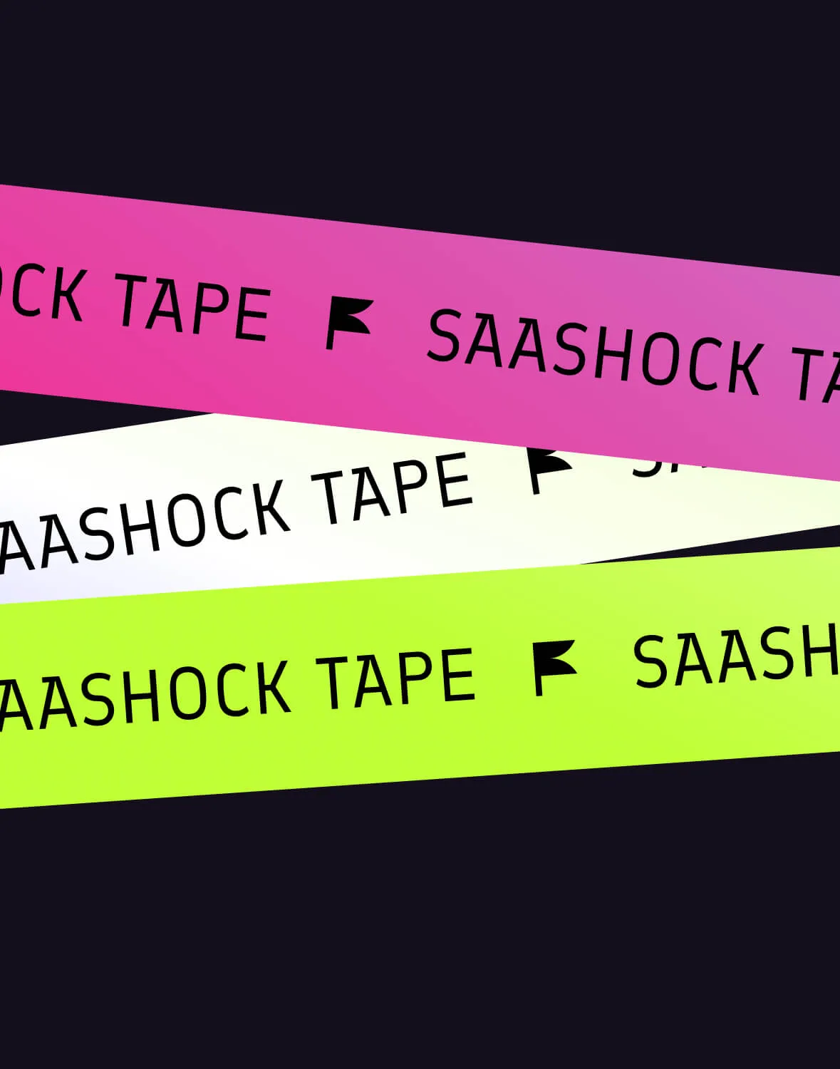
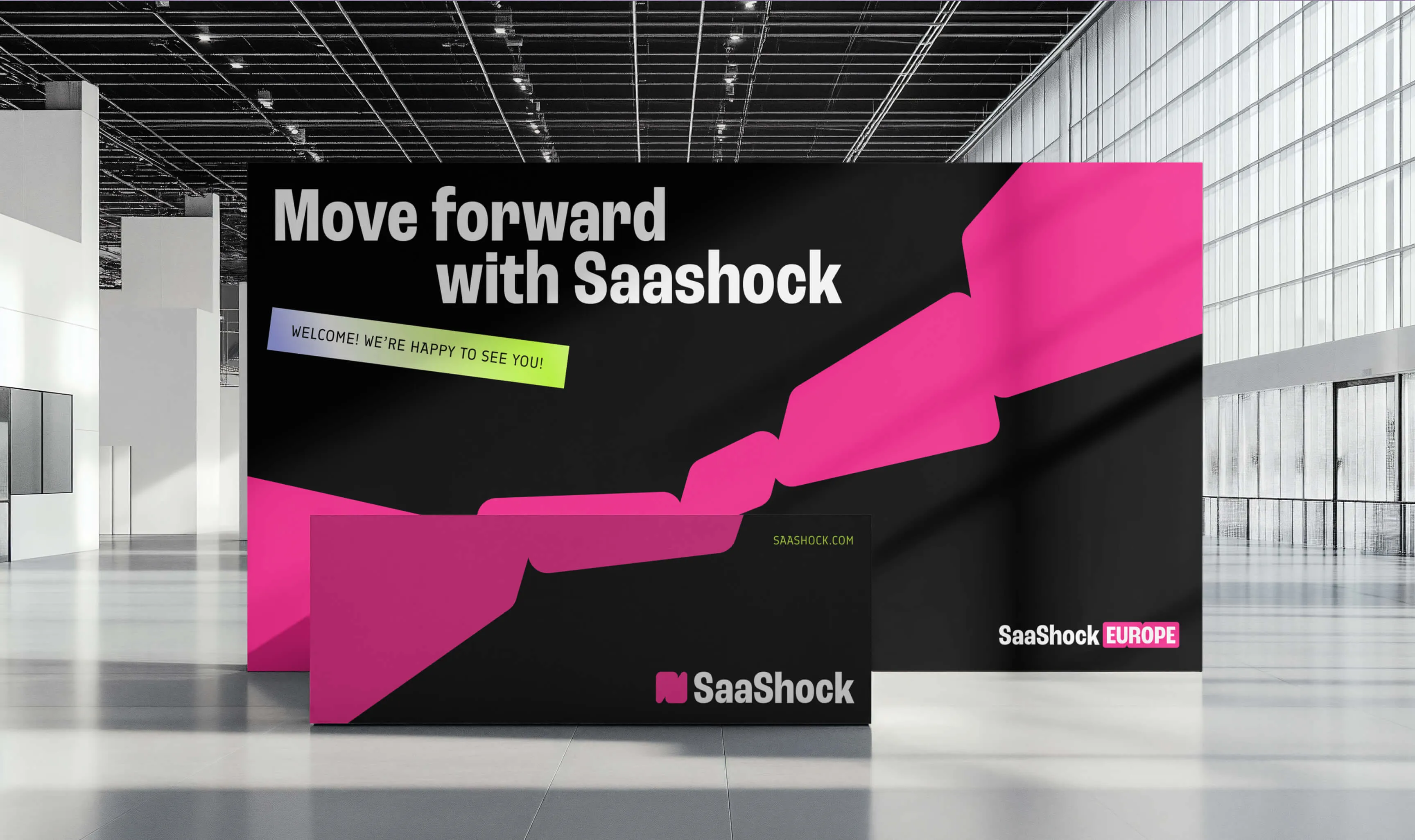
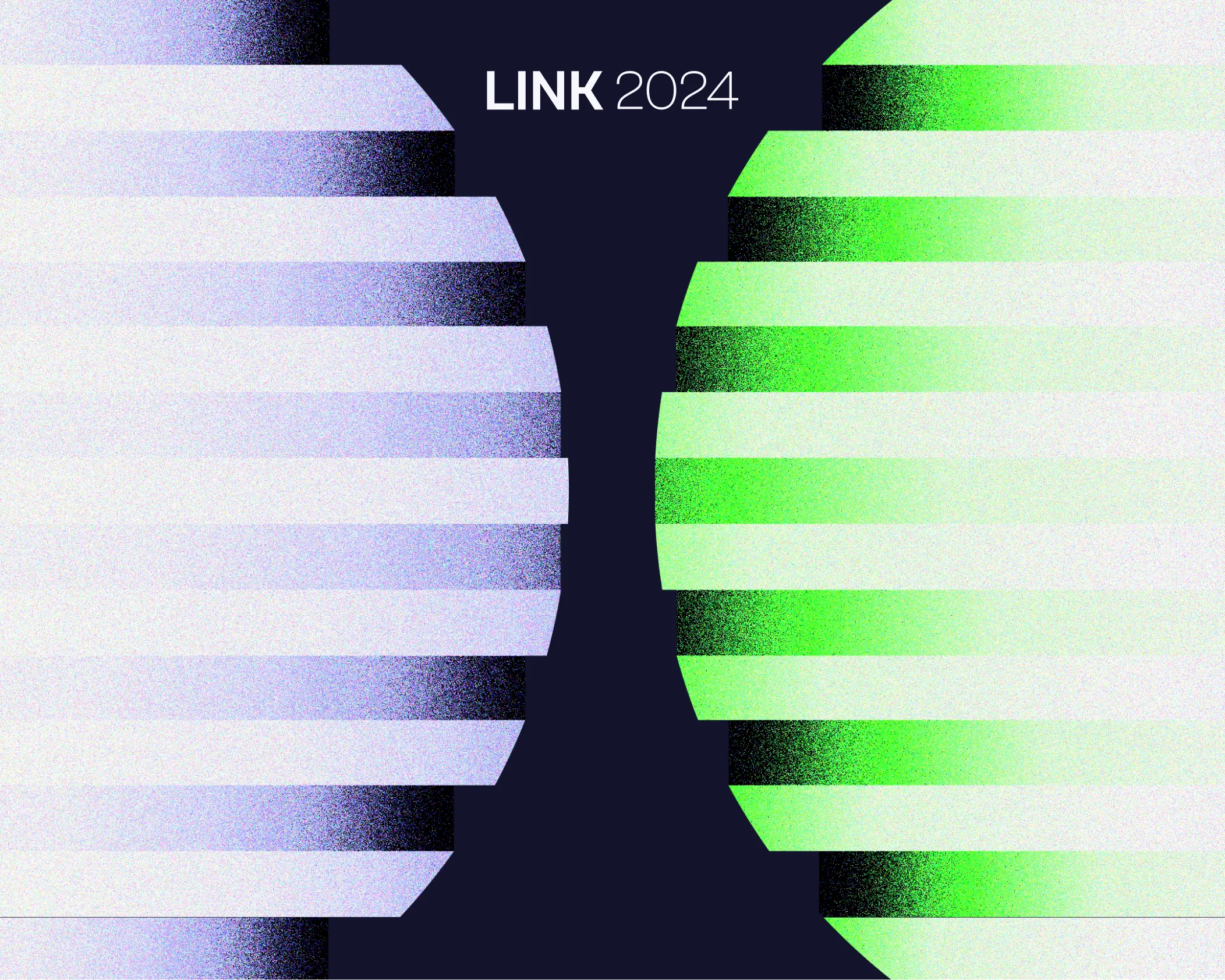
The logo and all graphic elements are based on one question: how do we show SaaShock's main value – connection? We created a special symbol called the "Link." By connecting two unique parts, this shape became the main graphic element and the foundation of the brand.
A Clean but Vibrant Look
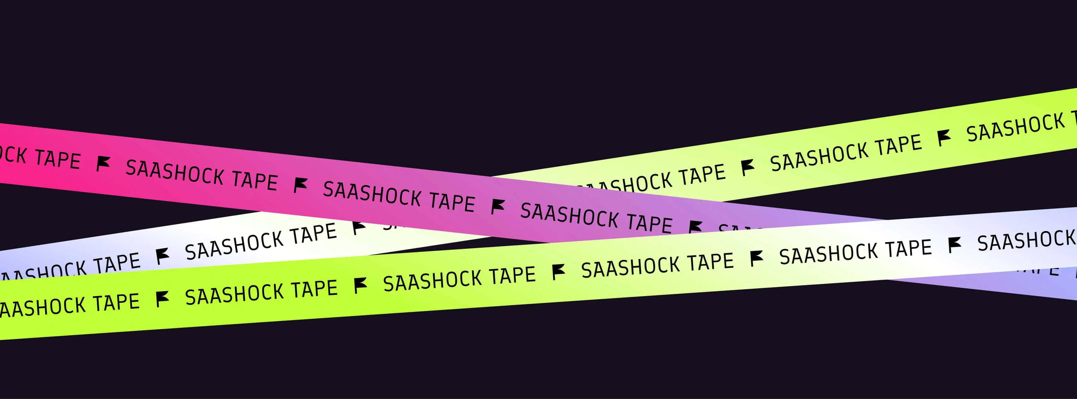
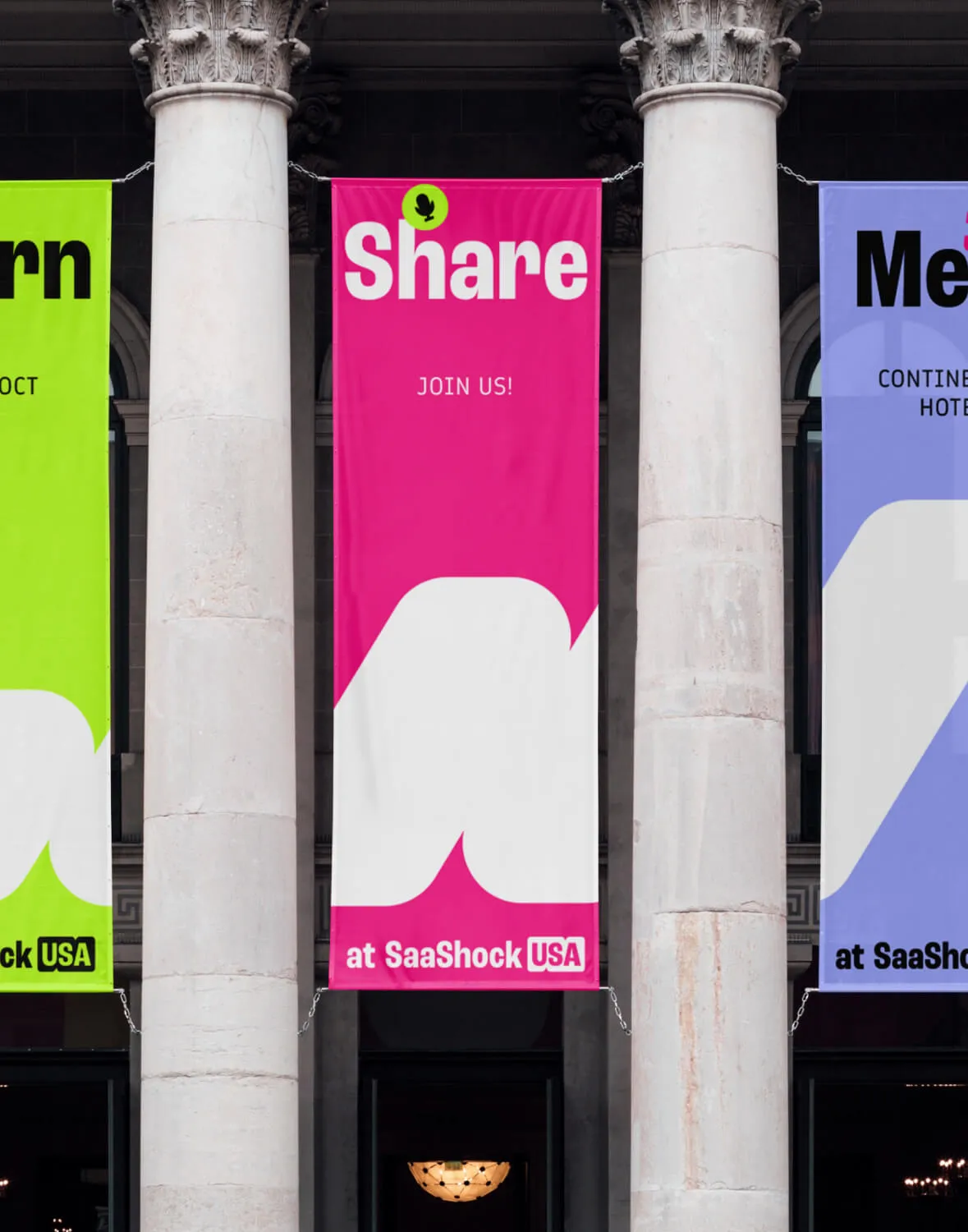
The challenge was to create a black-and-white brand that respects their history but also feels energetic. This is how we chose the color palette. When combined with the "Link" symbol, we can create many different shapes and frames to show the connections SaaShock helps build.
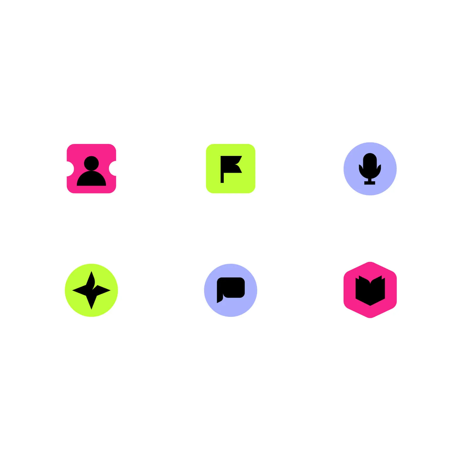
Photography & Icons
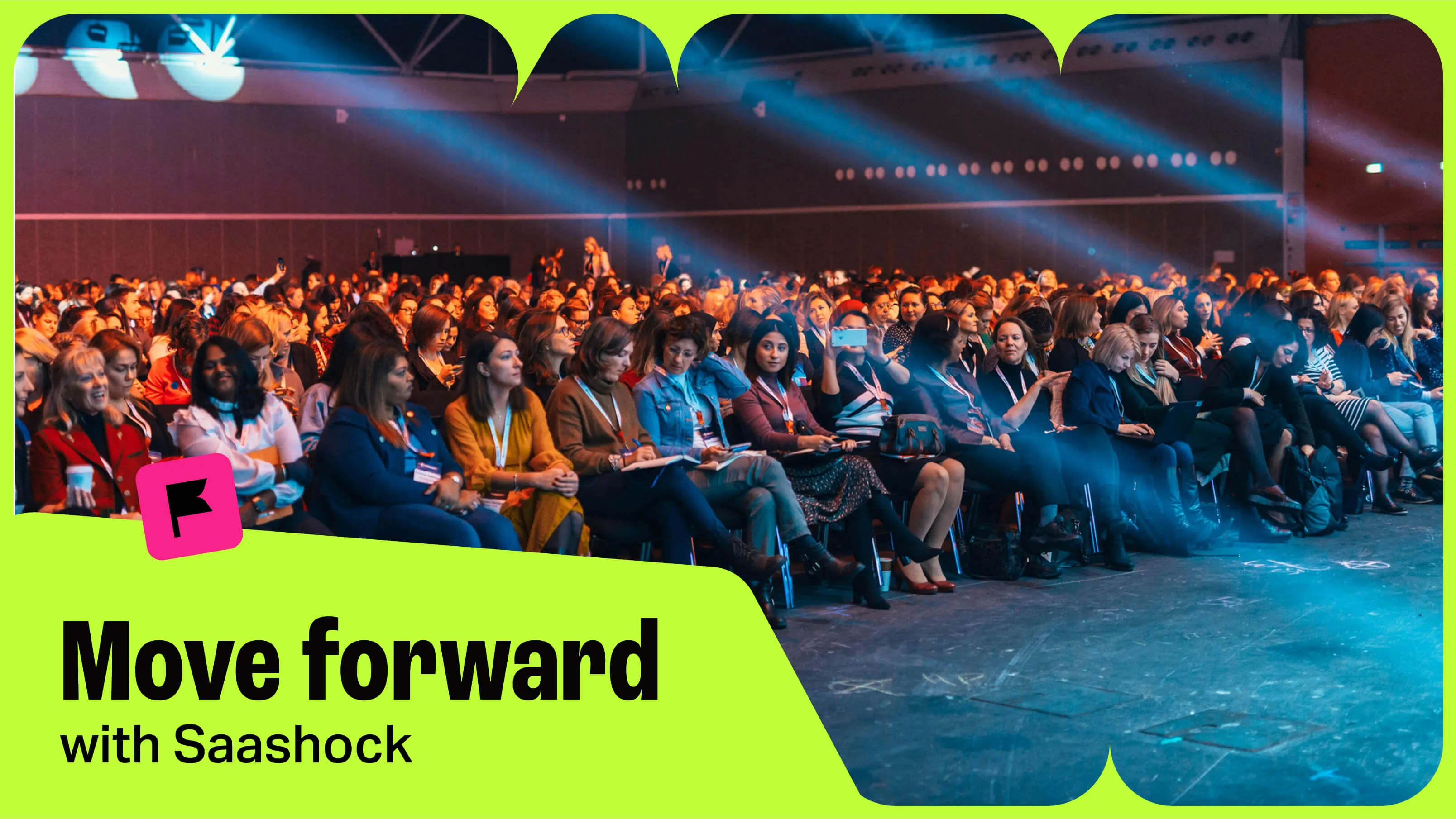
For the photography, we decided to use real photos from events because they capture the true spirit of the brand. We also designed a small set of icons that look like pins to create a friendly community feeling.
noboringdesign.com
Built with the Noboringdesign crew.
Project: Visual Identity for Saashock
My Role: Lead Designer
The Team:
- Creative Direction: Juan Pablo Lopez
visual identity
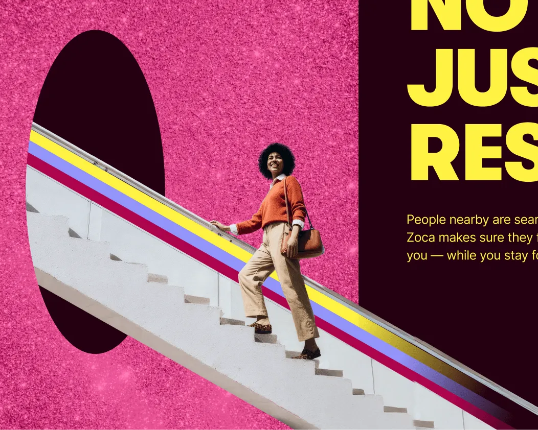
Exitfive
A community for B2B marketers
visual identity
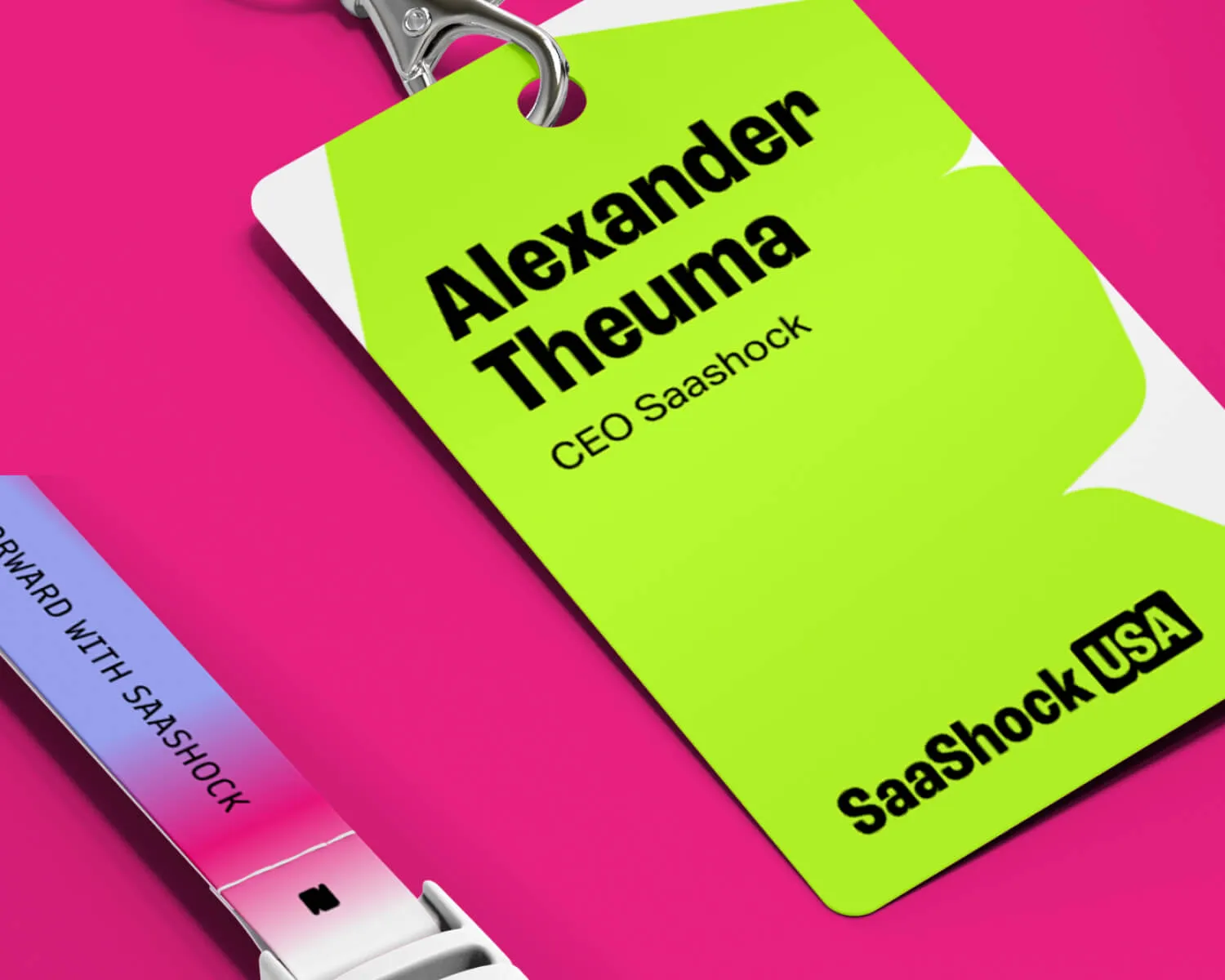
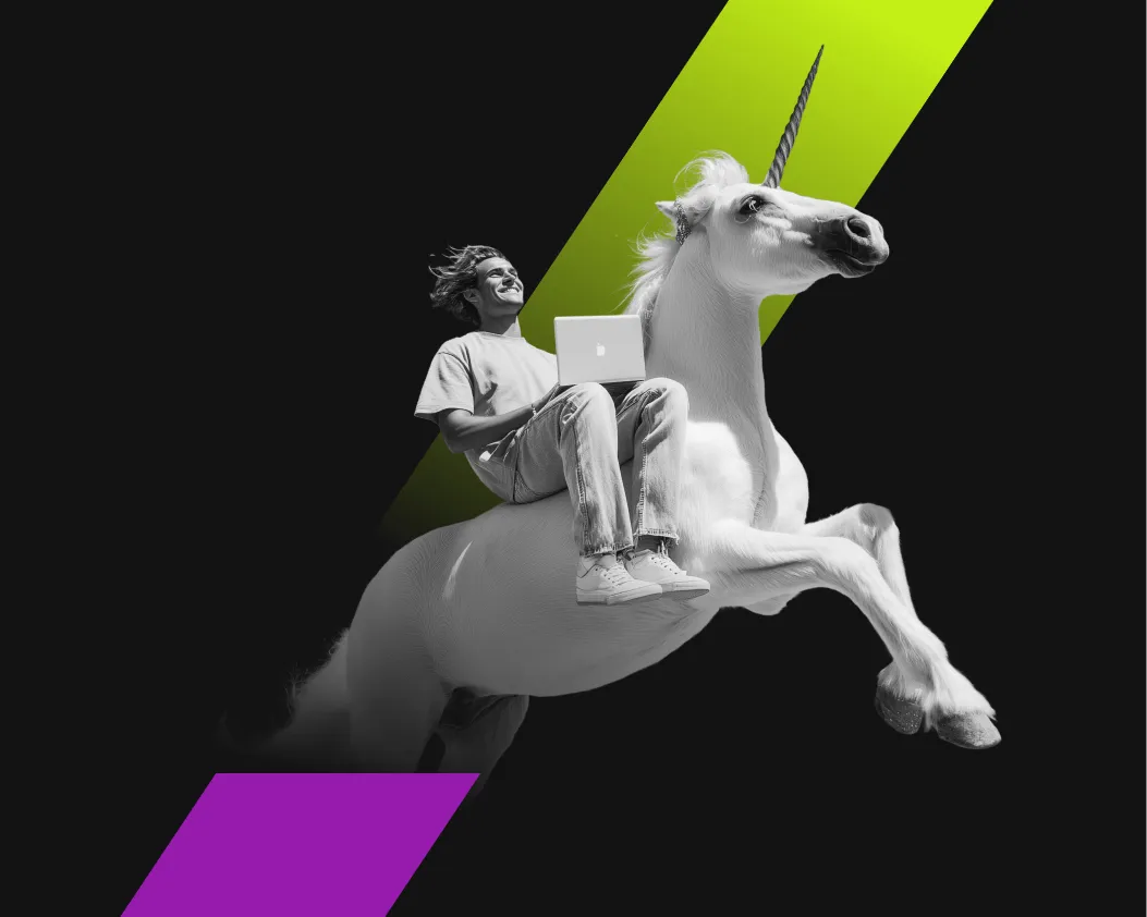
Saashock
A conference for SaaS founders and leaders
visual identity
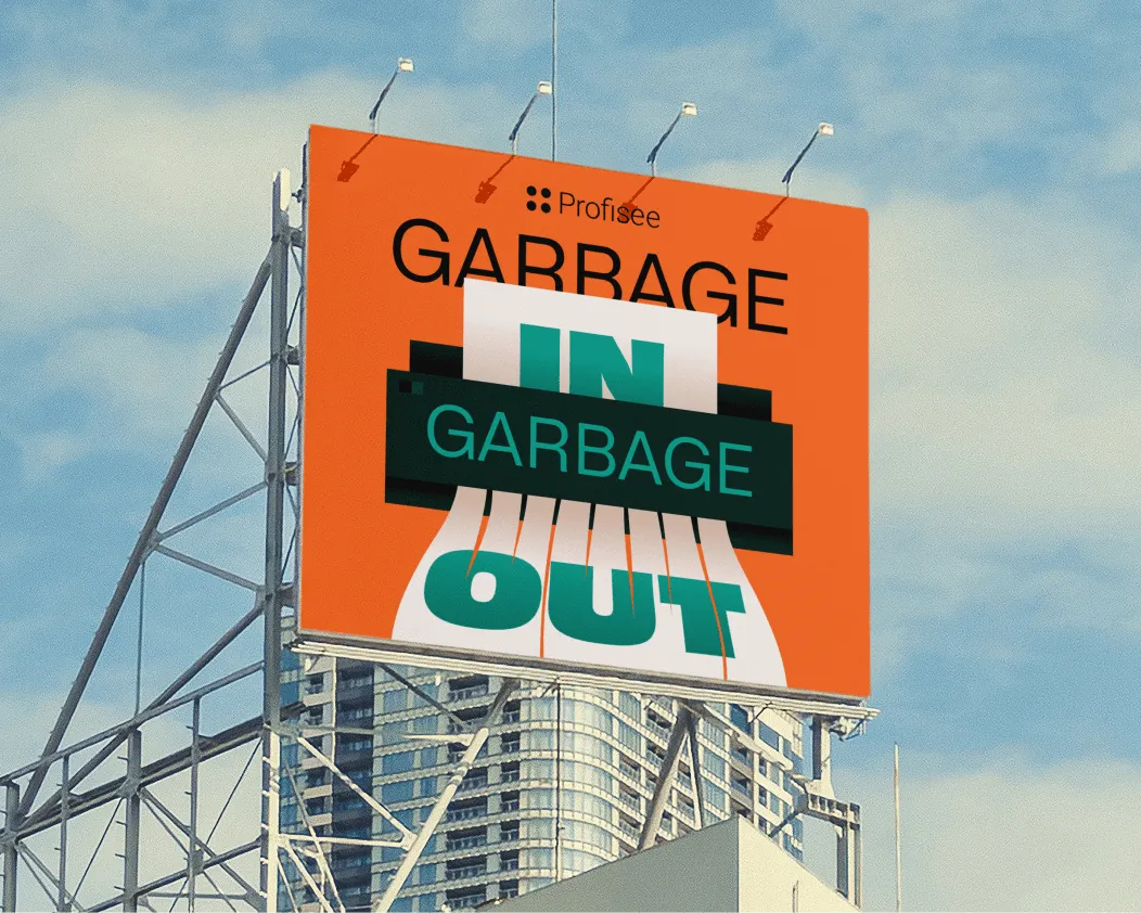
Rejected project
A European cybersecurity conference concept
visual identity
Mixmax
An AI-powered sales platform
visual identity
****
An AI-powered beauty & wellness marketing startup
Digital ads
Various Clients
A collection of my favourite ad designs
Animated videos
Allo Fiber
A TV advertisement for a US fiber internet provider
Illustration
Passion project
A personal illustration series on war and belonging