Project Overview
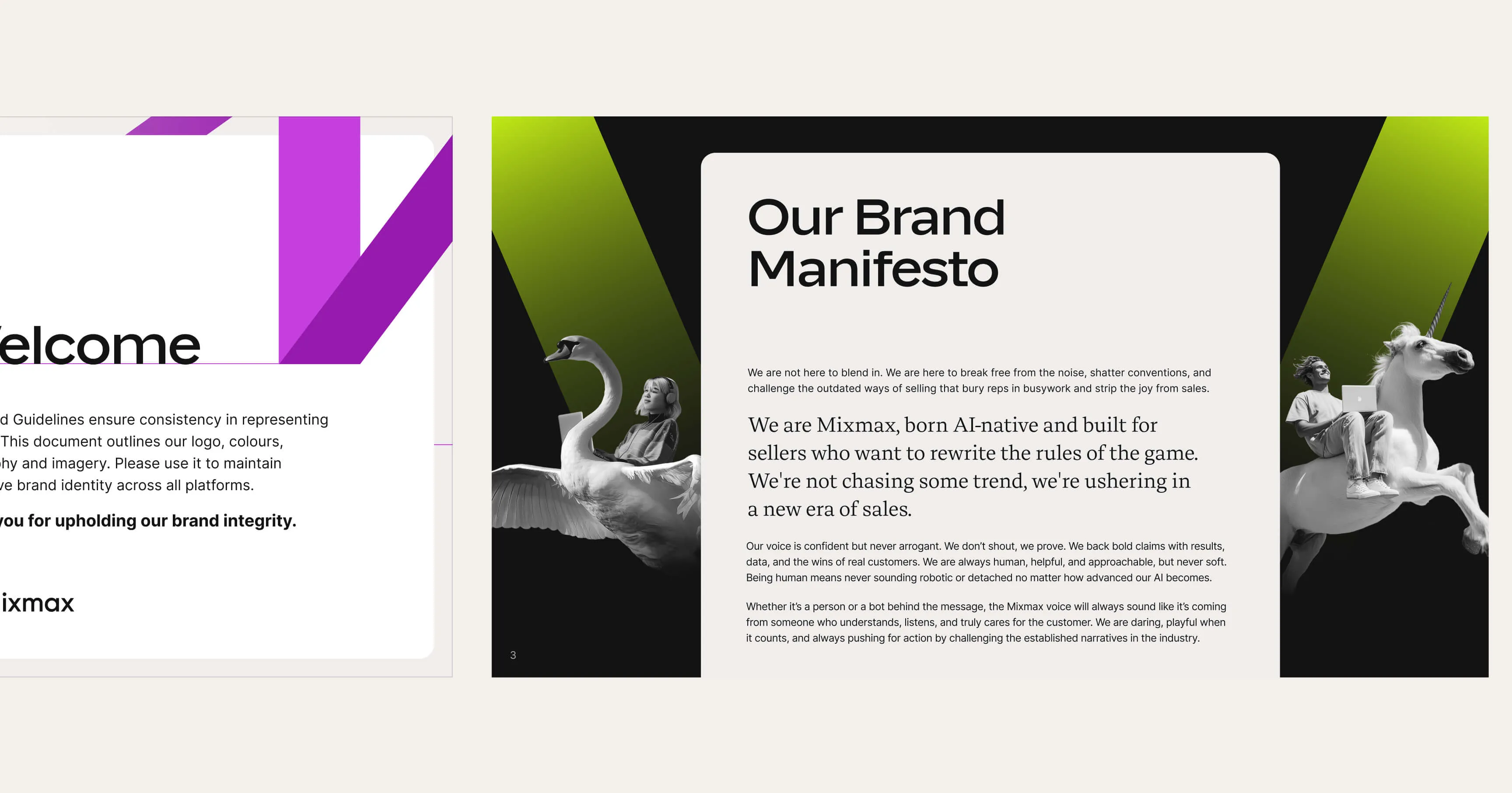
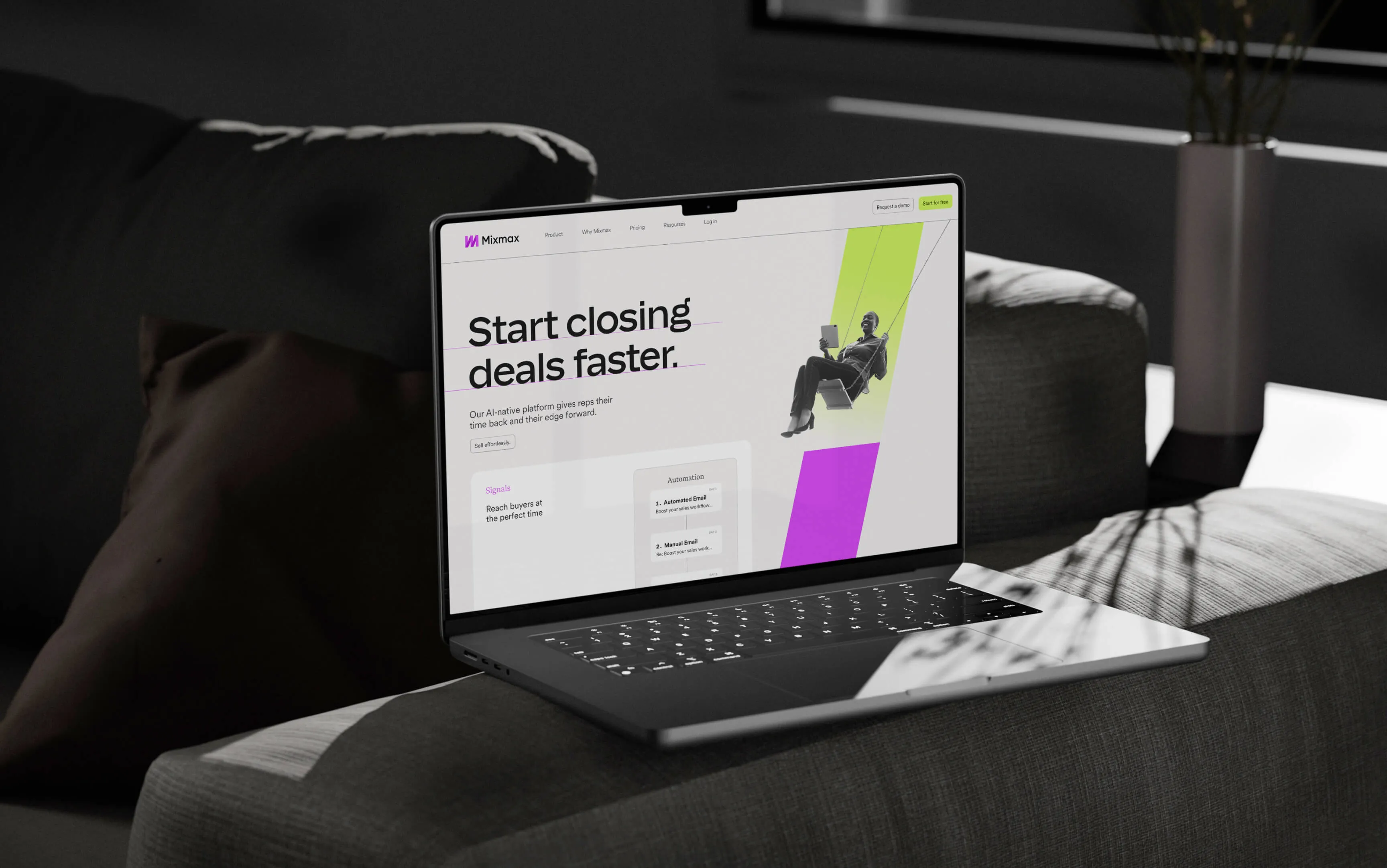
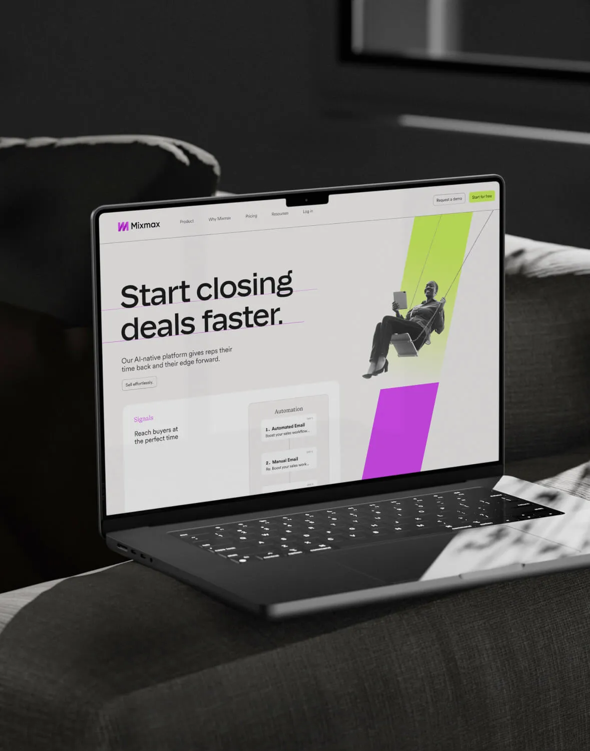
Mixmax is an AI-powered sales platform that helps teams close deals faster. As the product grew, the old brand no longer matched the company’s vision. I had the opportunity to build a new identity from the ground up to better reflect their voice, visuals, and story.
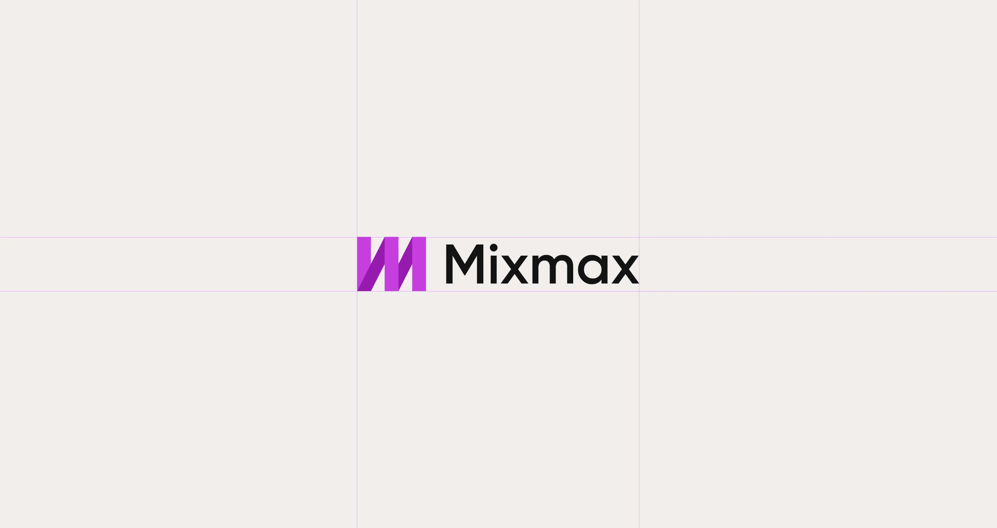
The Logotype
We updated the typography to match the brand’s new personality and typefaces. We also reimagined the existing ribbon-shaped "M" symbol. By refining its look and giving it a fresh meaning, we turned it into a modern mark that aligns with the new brand direction.
Ai Usage
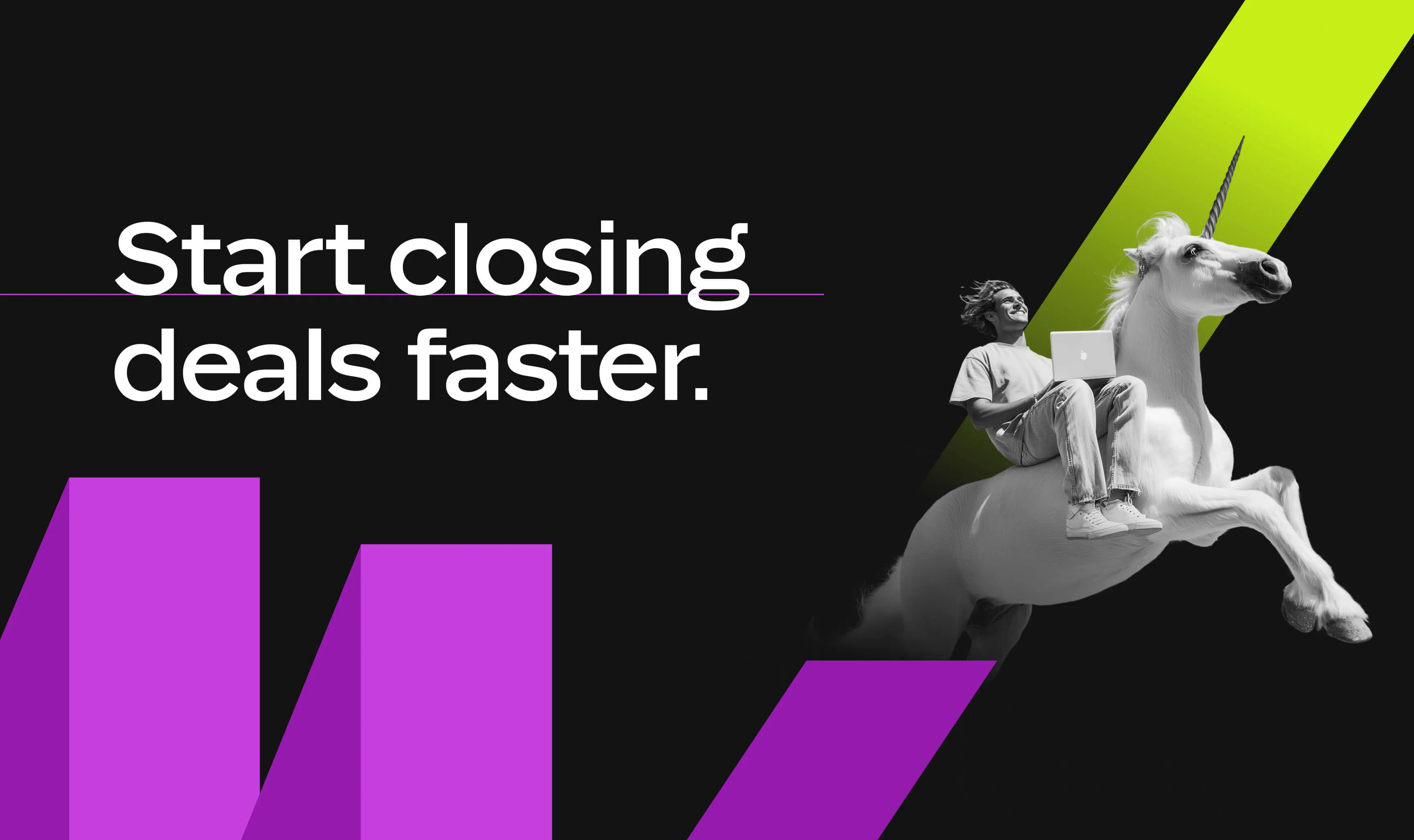
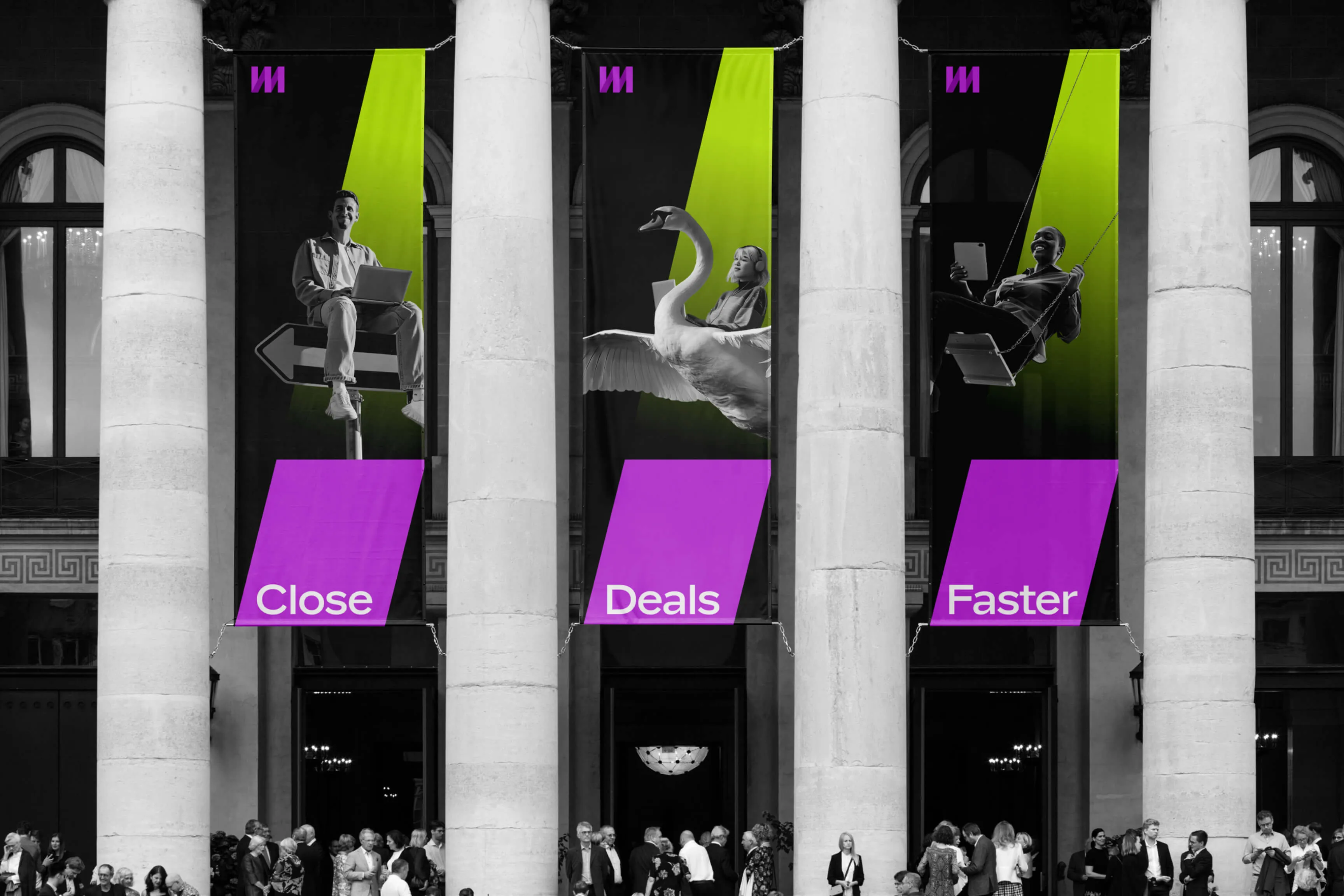
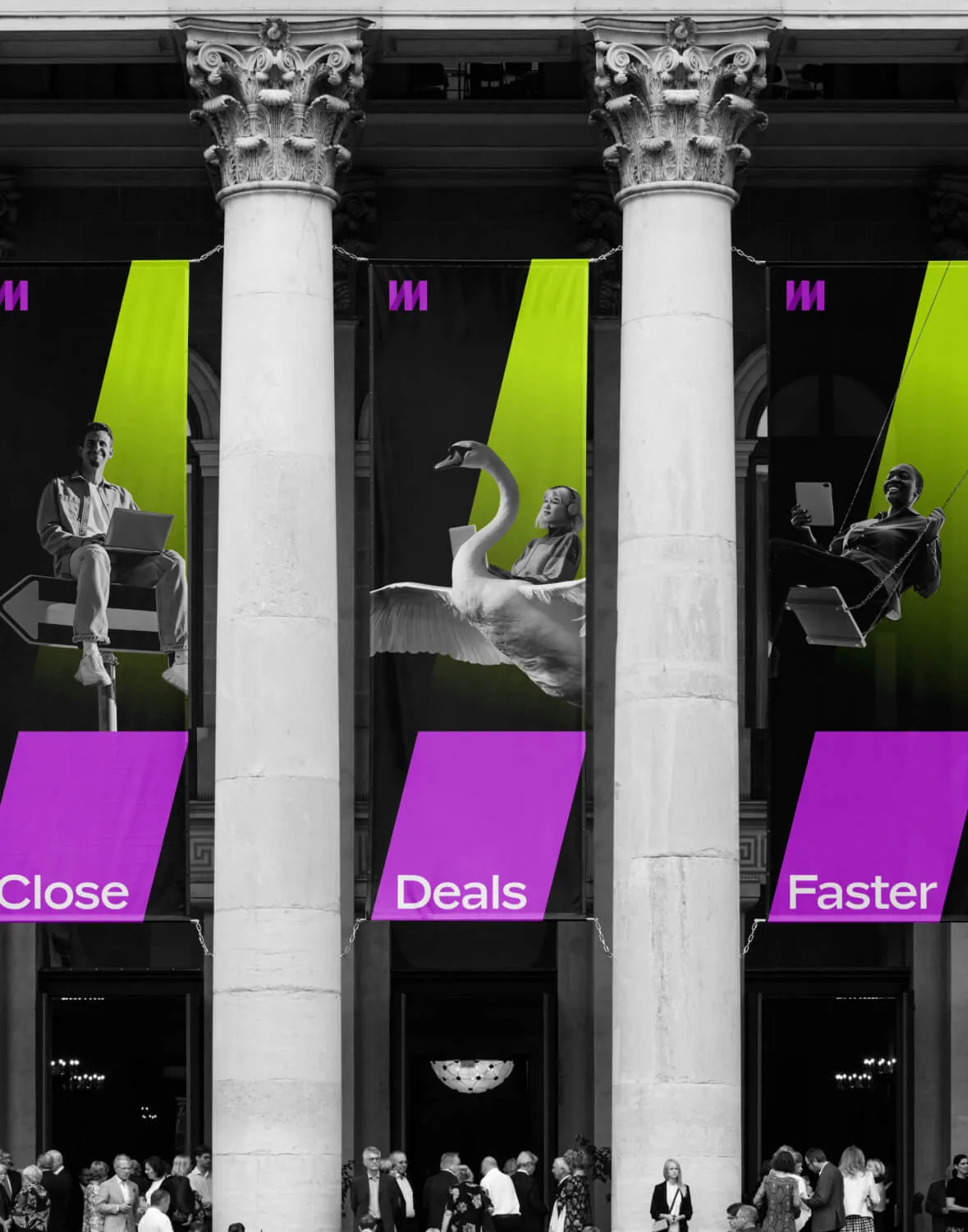
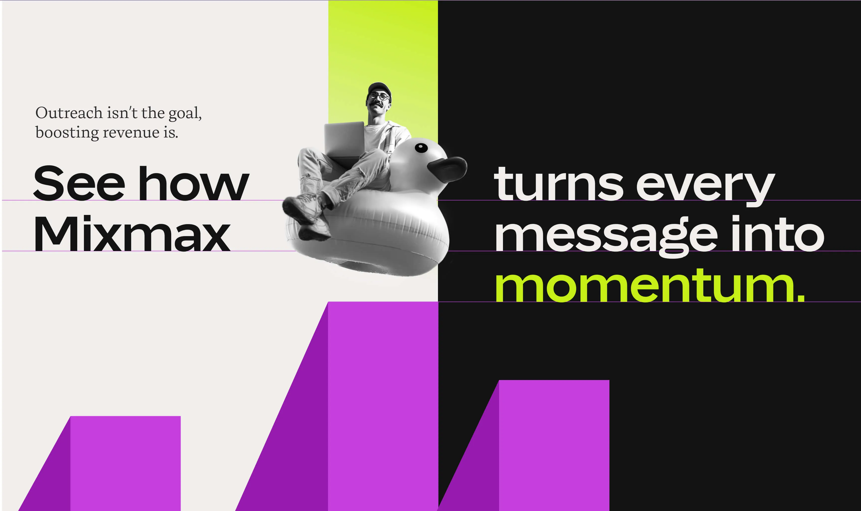
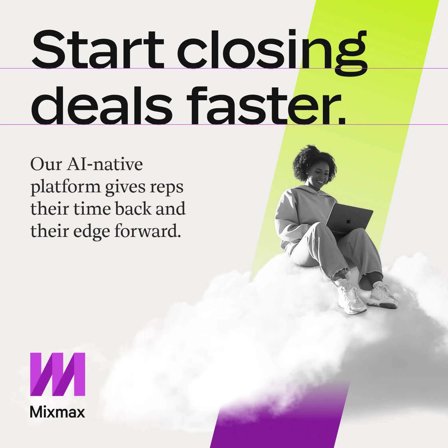
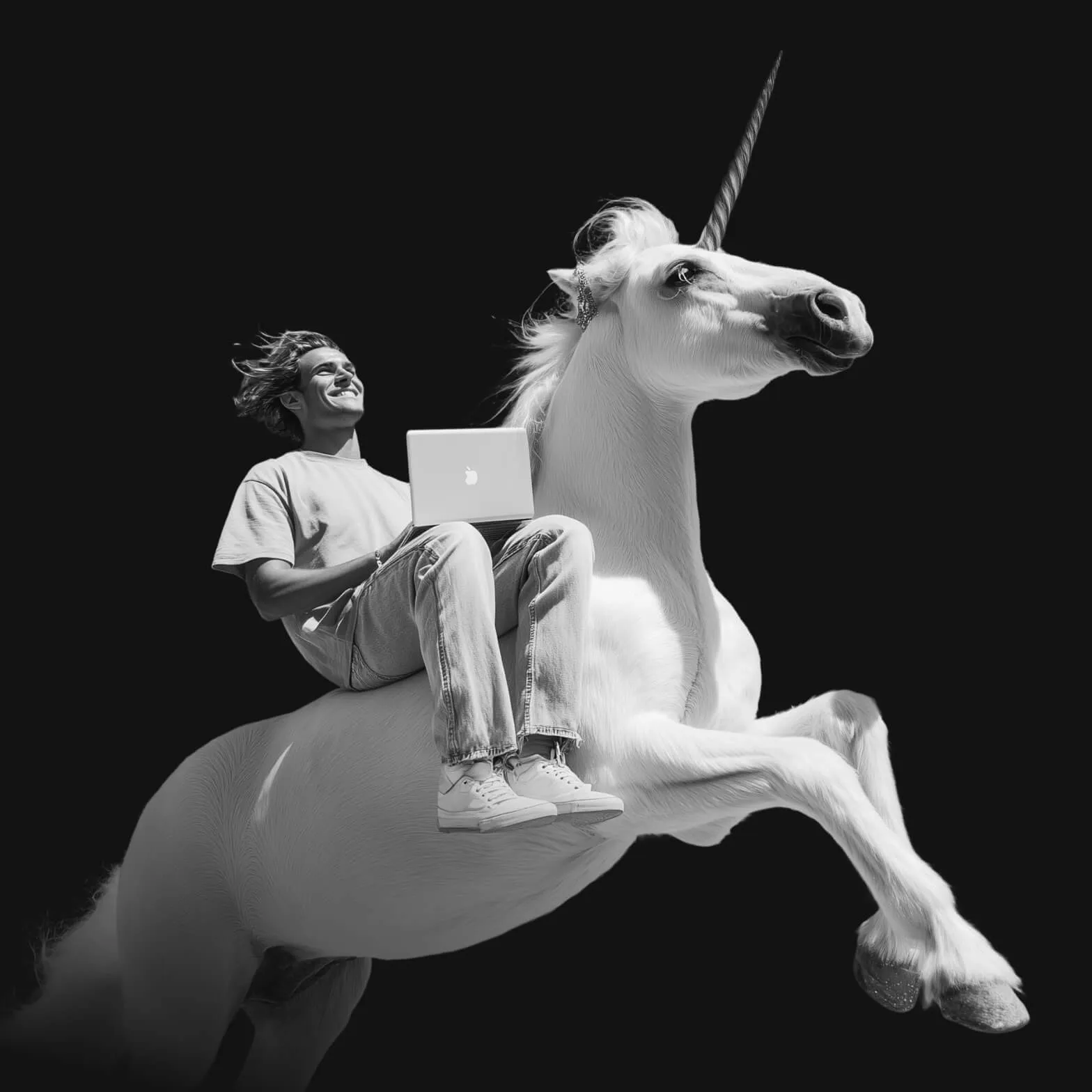
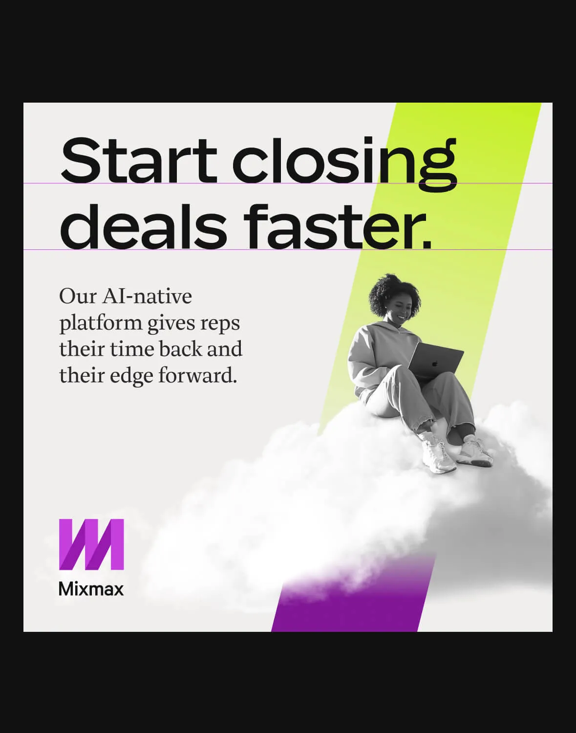
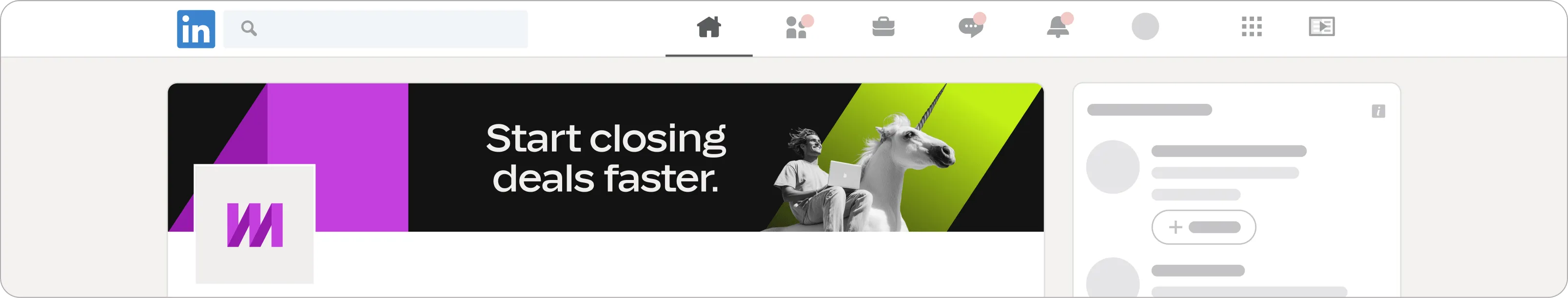
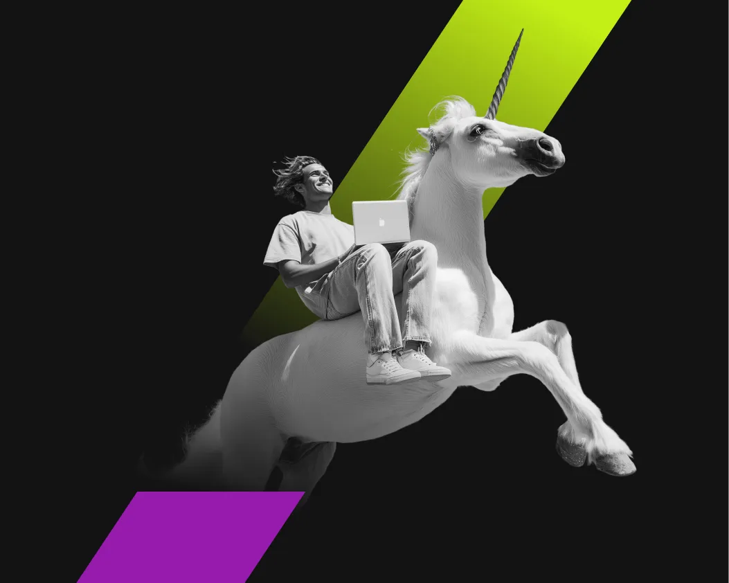
Mixmax wanted to keep a human feel, but standard stock photos didn’t fit their "rebellious and magical" brand archetype. Instead, we created "Sales Heroes." These are stylized characters showing sellers working from unexpected places – like on a unicorn or a cloud – to show that sales can be fun when powered by Mixmax.
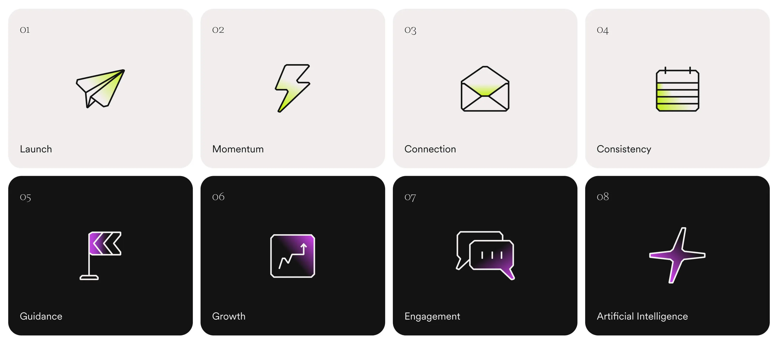
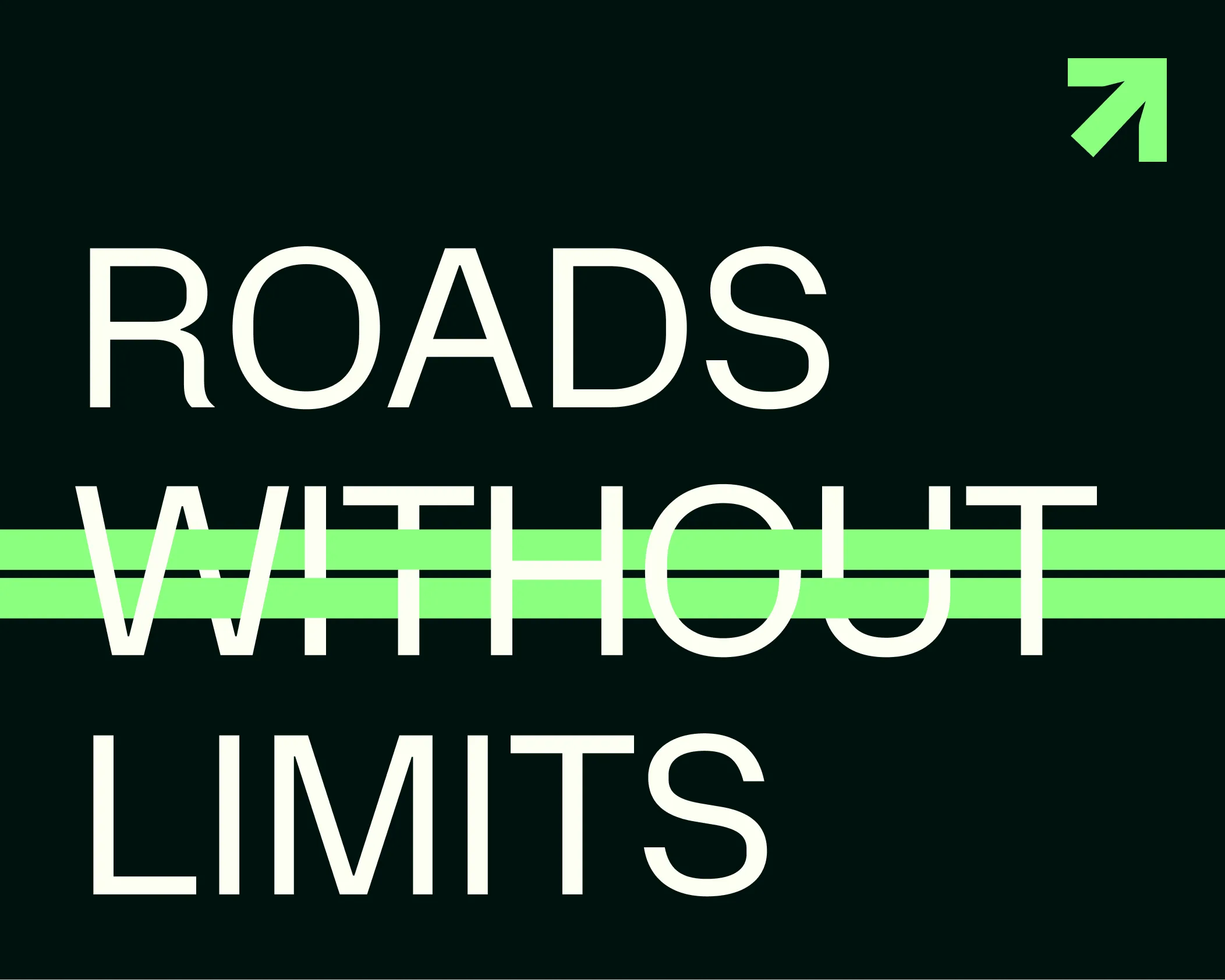
Momentum
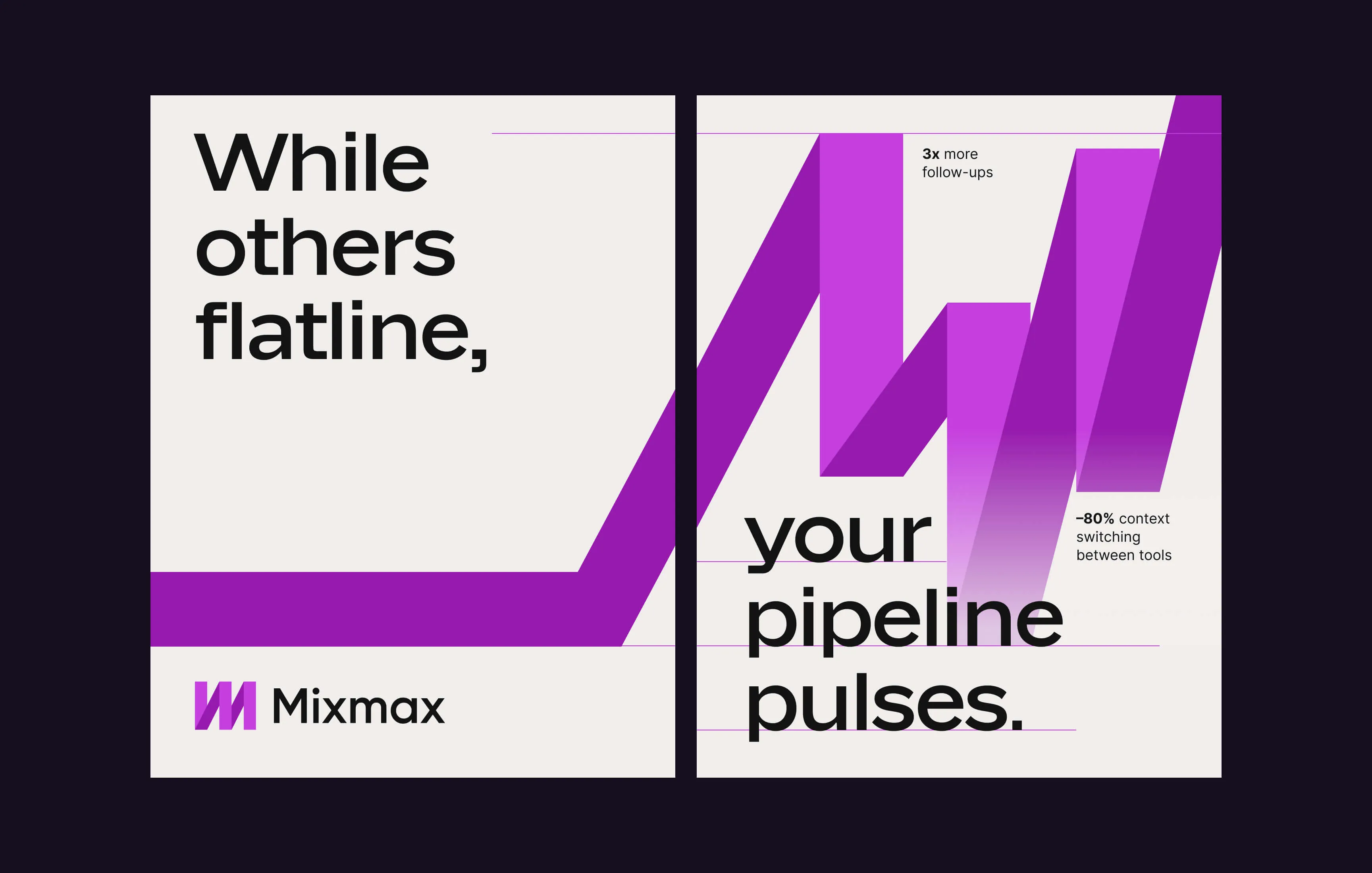
To tie the identity together, I created a graphic element called "Momentum Ribbons." Derived from the logo’s ribbon symbol, these lines act as a "pulse" for a deal. They represent the energy and movement of a successful sale, creating a consistent look across the entire brand.
noboringdesign.com
Built with the Noboringdesign crew.
Project: Visual Identity for Mixmax
My Role: Lead Designer
The Team:
- Creative Direction: Juan Pablo Lopez
- Copywriting: Nikola Sekulić
- Design: Hector Salazar
visual identity
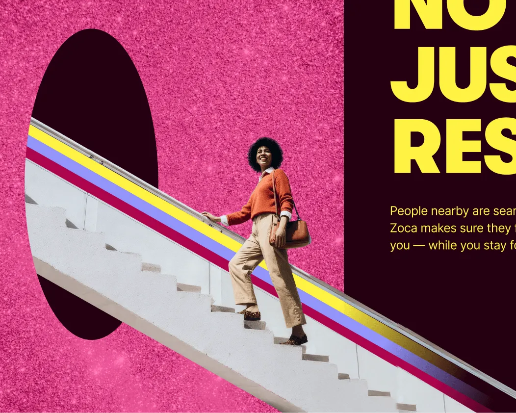
Exitfive
A community for B2B marketers
visual identity
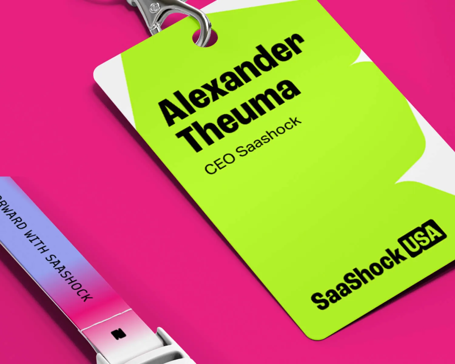
Saashock
A conference for SaaS founders and leaders
visual identity
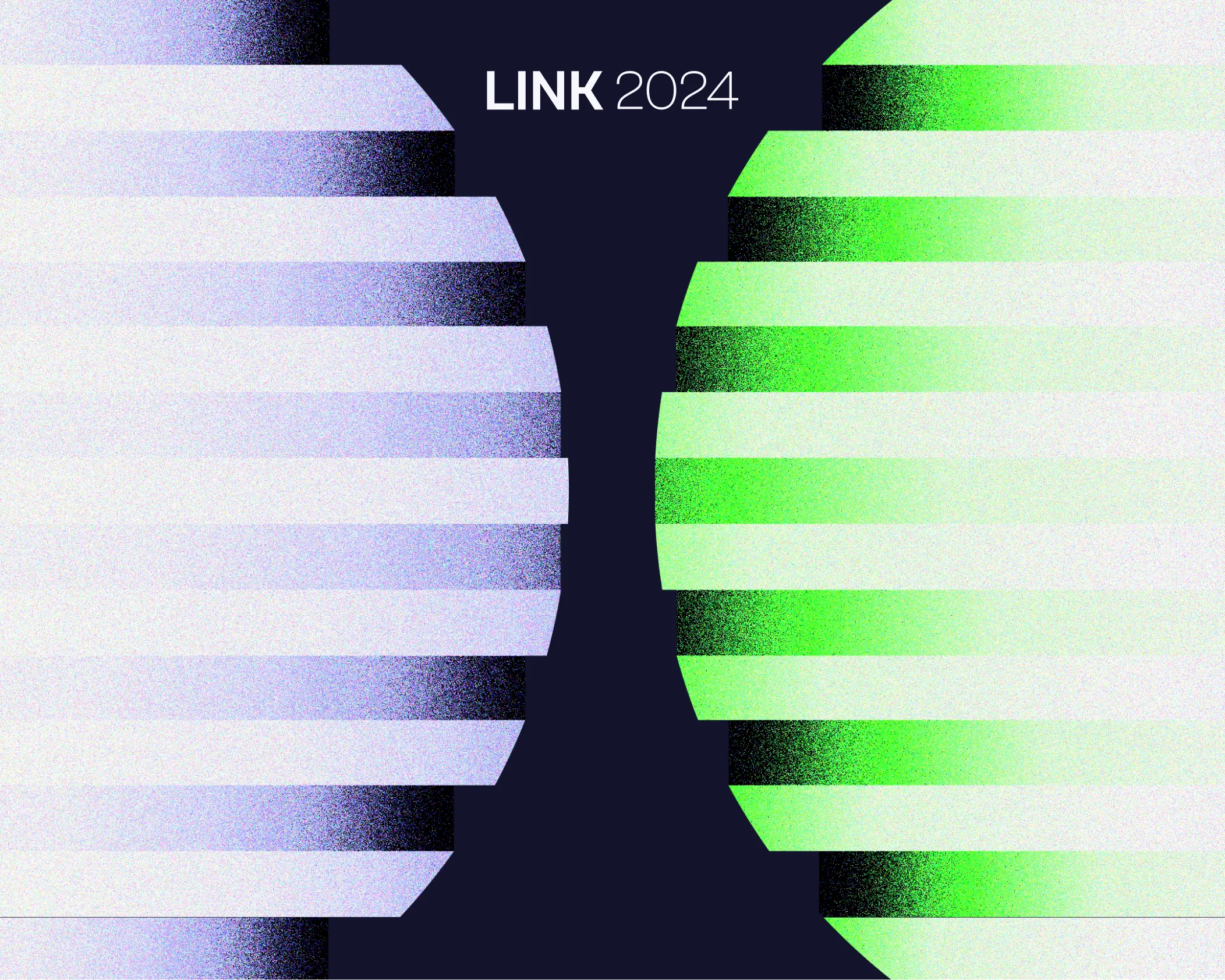
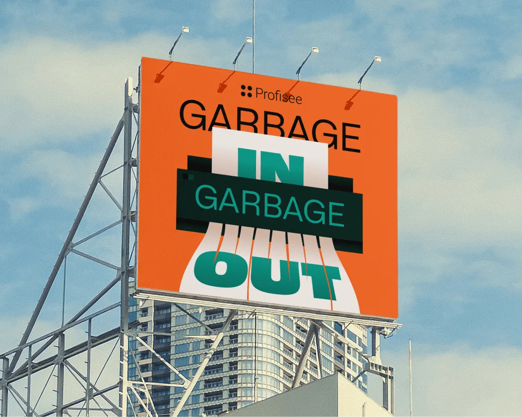
Rejected project
A European cybersecurity conference concept
visual identity
Mixmax
An AI-powered sales platform
visual identity
****
An AI-powered beauty & wellness marketing startup
Digital ads
Various Clients
A collection of my favourite ad designs
Animated videos
Allo Fiber
A TV advertisement for a US fiber internet provider
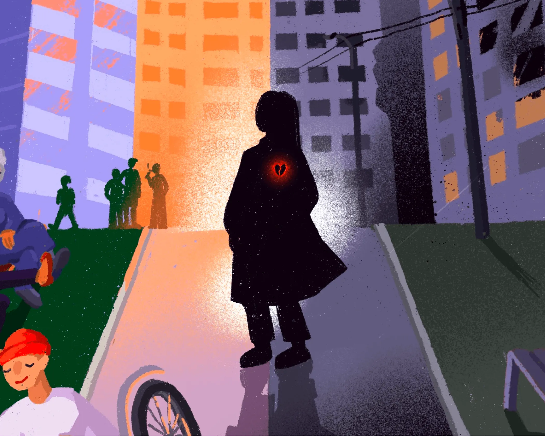
Illustration
Passion project
A personal illustration series on war and belonging